JULIANA CHILDREN’S HOSPITAL The Hague, the Netherlands
By Cor Wagenaar c.s.
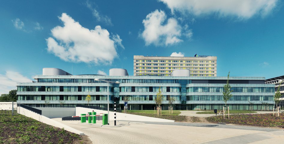
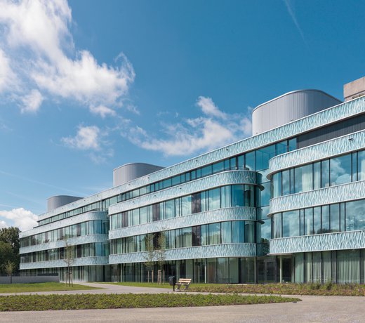
The Juliana Children’s Hospital (Kinderzieken- huis JK2) is part of the HagaZiekenhuis, one of the largest hospitals in the Netherlands. Formerly accommodated in various buildings across the city, the HagaZiekenhuis now concentrates all hospital facilities at a single site. Characteristic of the architectural solution for the new facility is that it respects and strengthens the qualities of the original design: opened in 1971, K. L. Sijmon’s Leyenburg Hospital, as it was called back then, is one of the Netherlands’ most striking examples of a classical Breitfuß hospital. It is dominated by a vertical slab made of prefabricated, sculptur- al concrete elements that crowns a flat, horizontal podium. Part of the reconstruction project was a thorough upgrade of the high-rise slab, realized by Architecten aan de Maas, and an extension of the horizontal podium. Covering an area of 34,500 m2, the new section accommodates anesthe- siology, oncology, hematology and a day-patient clinic (AOHD), as well as operating theaters, the Juliana Children’s Hospital and the Mother and Child Center. The contrast between the hard, industrial character of the existing building and the soft, rounded corners of the children’s hospital is hard to miss. This new wing evokes the serenity of the Art Deco style of Miami Beach. Clearly, the Juliana Children’s Hospital is designed as a signature building that puts the children at the center. This was one of the client’s main goals, and not surprisingly the Planetree concept was the primary source of inspiration. All care and cure processes are organized accord- ing to Planetree principles.
The Juliana Children’s Hospital has direct access to a surrounding garden, designed by landscape architects Karres + Brands, which is visually linked to abundant greenery inside, mostly potted plants. Research suggested that whereas their parents prefer views on the park, the children like to see people moving around in the squares and the main street. Studies have shown that a child-friendly environment can provide distrac- tion and reduce anxiety and the perception of pain. This contributes toward creating a more positive hospital experience.
Discussions with a number of user groups, which included groups of children, provided valuable information on how they experienced various hospital spaces. MVSA invited the experience design agency Tinker Imagineers to create a ‘moving’ storyline for the Juliana Kinderzieken- huis. Five cuddly characters – Hugg, Happy, Fold, C-bot and Fizzle – come to life all around the children in unique, animated wall projections. They accompany children on their ‘adventure’ and make them laugh. . A wall-sized digital screen that interacts with the children is probably the most striking example of the use of modern media.
Abundant public spaces are distributed through- out the three connected volumes of the new build- ing, two of which are organized around glazed patios of four floors and contain the new children’s hospital. In order to guarantee the children’s hospital direct access to its green surroundings, the operating theater that is also situated in the extension was transferred from the outer perimeter, where it was first planned, to the interior corridor. Thus the placement of the children’s hospital encourages the children and their parents to discover the world outside the patient wards.
The patios are flooded with daylight and most destinations are visible from the public spaces. In the Juliana Kinderziekenhuis, transparency is key to wayfinding. The architects created a subdued color palette which is used throughout the total complex. This basic palette, consisting of different ‘whites’, ‘grays’ and a darker an- thracite hue, brings brightness, clearness and tranquility to the environment.
To emphasize the identity of each care unit and different specialties such as radiology, policlinic and anesthesiology, accents of bright and strong colors were added. The inpatient department has mainly single bedrooms, which are spacious enough to allow parents to spend the night with their children. Wherever feasible, green roofs have been applied as a form of natural isolation. Continuous off-white horizontal bands with rounded corners, fluent spaces, a lavish use of glass and the whitish finish of the floors create a luminous, clear atmosphere that acts as the backdrop of furniture in bright colors.

