Project information
-
Location
Maastricht
-
Project completion
2012
-
Building surface
46 m2
-
Client
Shoebaloo B.V.
Sculpting with line
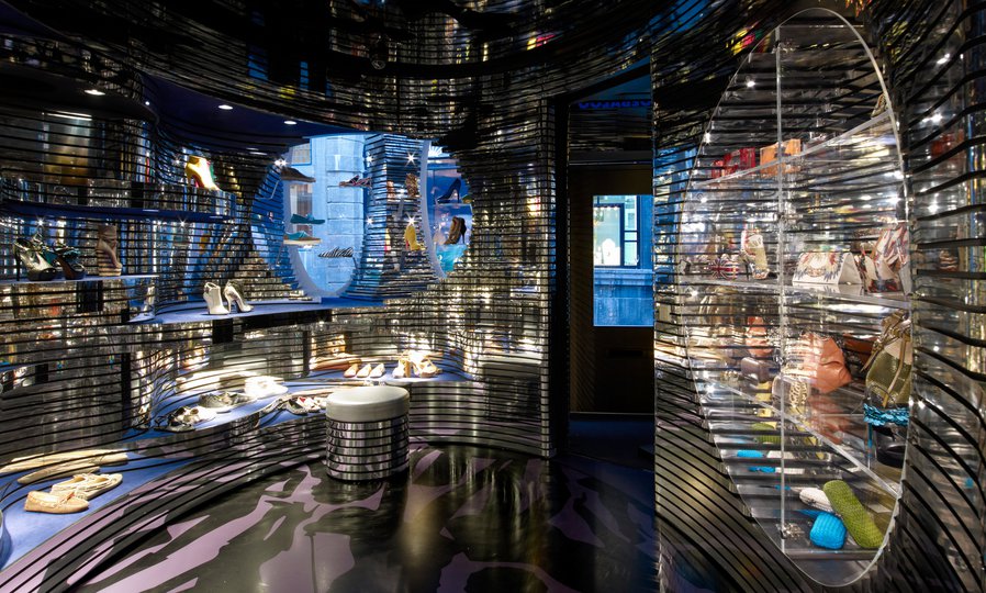
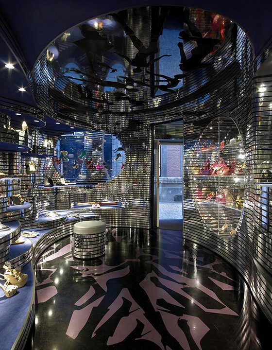
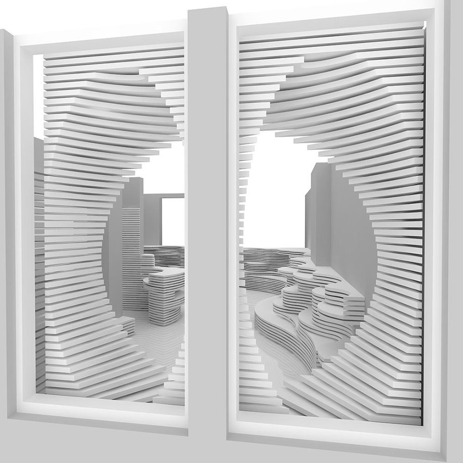
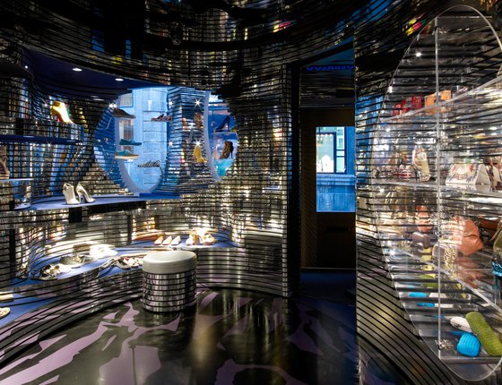
While the building’s historic exterior is unchanged, inside the 46 m2 space is like entering a hidden world. Nature, specifically the rugged forms of a canyon, was our inspiration. We created an Aladdin’s cave experience, with undulating walls built up in geological layers. The entire interior is based on sinuous horizontal lines that protrude and recede to create a seamless three-dimensional effect.
Through the looking glass
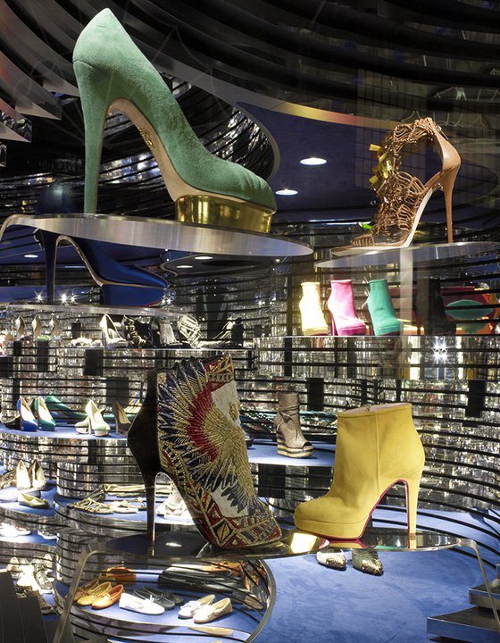
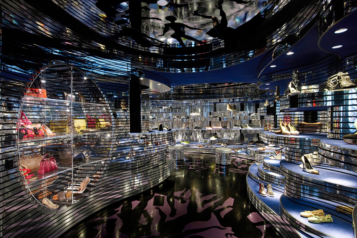
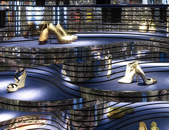
Relatively low-level lighting makes for an atmosphere of mystery, while the polished aluminium finish adds reflection and sparkle, as well as helping to create the illusion of a bigger space. While the walls gleam, the shoes themselves stand on matte displays: deep-blue platforms covered in artificial suede – a perfect surface for product display and one that contrasts beautifully with the shiny, sinuous elements.
Silhouette study
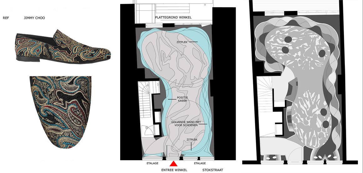
The space is divided into two elliptical areas at front and back, which flow smoothly into each other. An integrated cash desk is placed between them. For the floor, we created an intricate pattern featuring silhouettes of female figures posing with their shoes or handbags. The printed motif, which made of foil and finished with a transparent PU coating, was inspired – appropriately enough – by a pattern used on a Jimmy Choo shoe. It is repeated on the ceiling.
Maximising space
Thanks to the variations in the depth of our linear design, we were able to effortlessly incorporate the sales counter, a display case for bags and accessories, and the seating elements, maximising the compact area of the store.
Window world
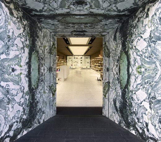
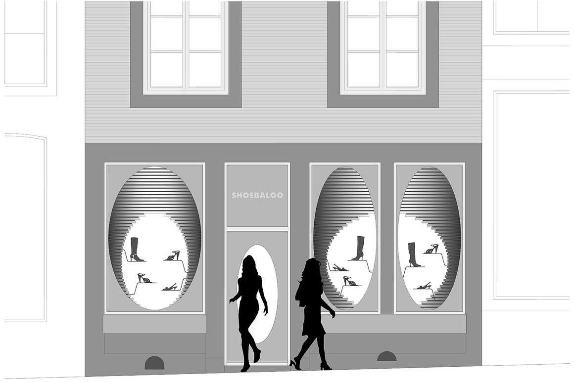
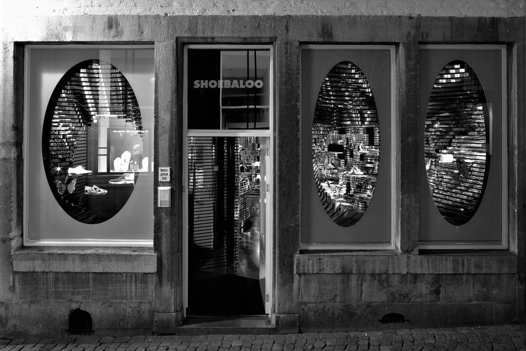
As with other Shoebaloo stores designed by MVSA Architects, the shop in Maastricht is rather closed. The windows contain two elliptical openings, which are angled so as to provide a subtle and shifting view of the interior, while also showcasing the products at the forefront of the now-you-see-it-now-you-don’t vignette.
Brand values
As with all MVSA’s stores for Shoebaloo, we created an environment that reflects its brand values: luxurious high-end design, with an element of surprise. The space presents the premium product to advantage, with creating a novel and fun experience for customers.
Factsheet
Shoebaloo Maastricht
-
ADDRESS
Stokstraat 25a 6211GB Maastricht
-
CLIENT
Shoebaloo B.V.
-
PROGRAMME
Interior design, retail
-
BUILDING SURFACE
46 m2
-
START PROJECT
2011
-
COMPLETION
2012
