Project information
-
Location
PC Hooftstraat, Amsterdam
-
Project completion
2018
-
Building surface
80 m2
-
Client
Shoebaloo B.V.

The joy of the real
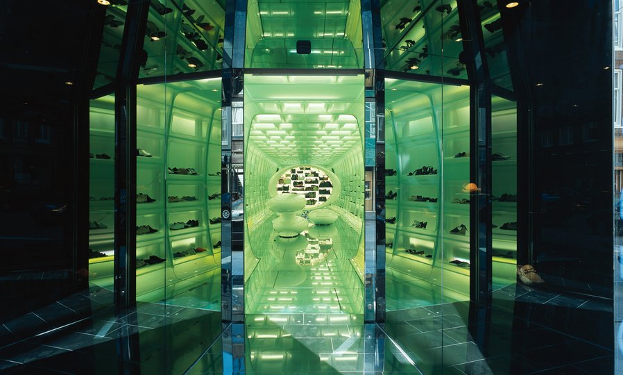
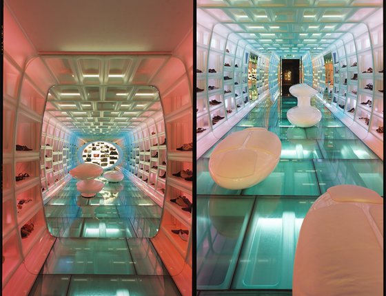
Post internet-shopping, experiences matter – and none more so than the shopper’s experience of the product. When shoes can be viewed digitally across so many platforms, seeing them ‘in the flesh’ and trying them on becomes a unique encounter. Our new design seeks to emphasize the physical products, creating extended display space and a shopping experience that beautifully frames them. In a digitally-oriented world, real becomes hyper-real.
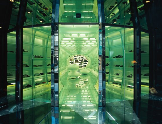
A changing retail landscape
On the street too, time has not stood still. The PC Hooftstraat is Amsterdam’s ritziest shopping area. Recently, it has become more stylish than ever due a 2016 redesign resulting in wider, boulevard-like pavements and a higher quality of public space. Our new design for the Shoebaloo store takes advantage of this changed streetscape in a most surprising way: our store is the only one on PC Hooftstraat with no shop window. This calculated intervention places all the attention on the amazing entrance, drawing passers-by inside, where their first experience of the all-important product is direct and unmediated.
The grandest of entrances
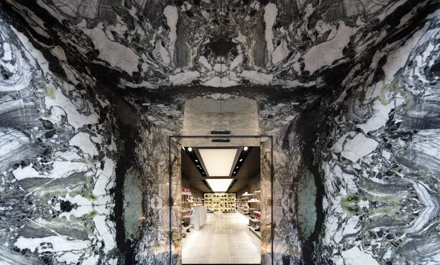
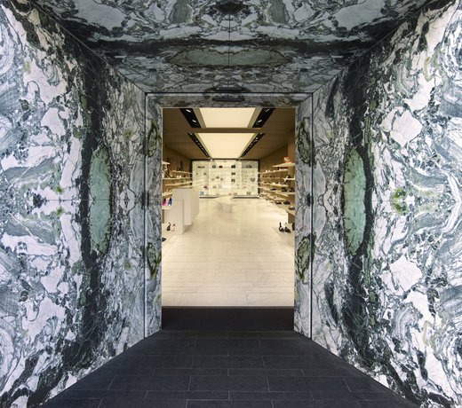
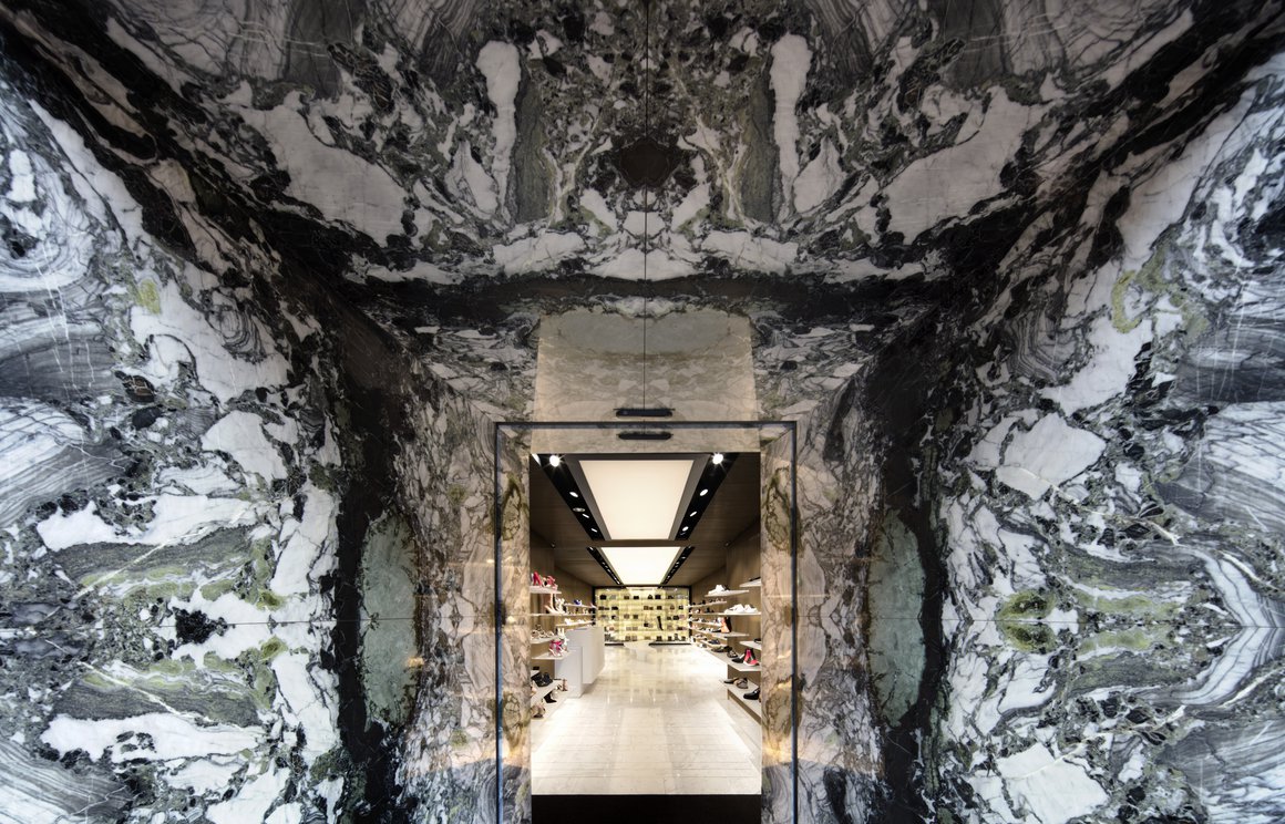
Our store has no windows, instead relying on the impact of the most spectacular entranceway on the street. This is where the unique customer experience begins, on the threshold of the space. The angled entrance offers tantalizing glimpses of the interior from the street, while the exaggerated perspective creates a tunnel dynamic that draws customers inside. The beautiful marble used for the entrance is Ice Stone. We used it to create a spectacular mirrored pattern that makes the most of its dark veins and unique green ‘eyes’. This works to focus the attention on the delights within.
Louvre love
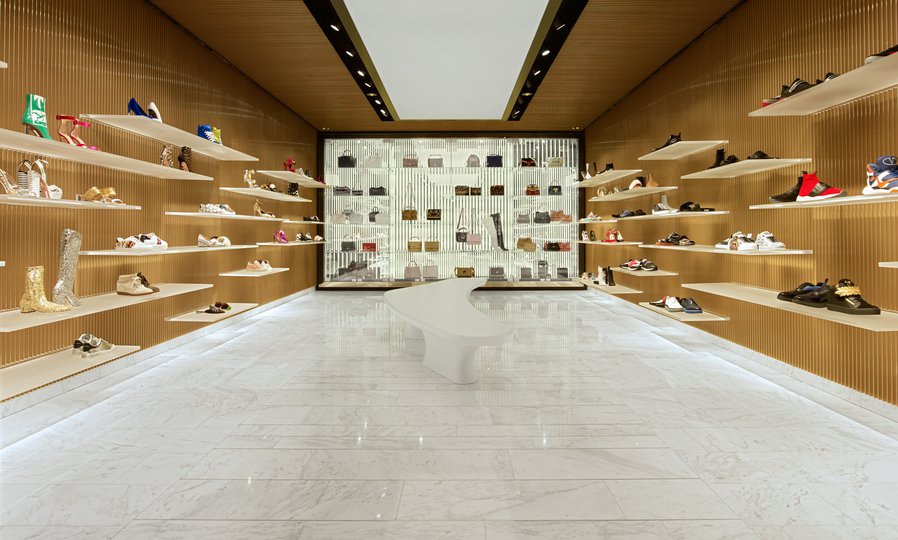
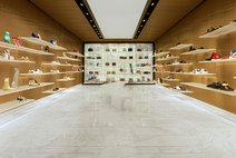
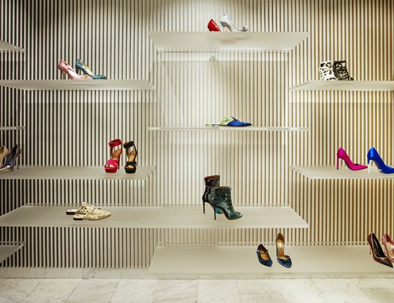
Inside the store, delicate louvres – coloured gold as you head into the store, then anthracite when you walk the other way – achieve a subtle colour-change effect. The louvres were created from aluminium strips, gold on one side and anthracite on the other, placed on the white wall and ceiling surfaces. The customer experiences the sophisticated colour gradient change in an almost subliminal way as he or she moves through the space, using the middle of the store as a ‘turning point’.
These subtle optical effects give the new Shoebaloo store a kind of melting, shimmering glamour. In this mirage-like interior, the gorgeous shoes appear all the more solid, substantial and desirable.
Power to the product
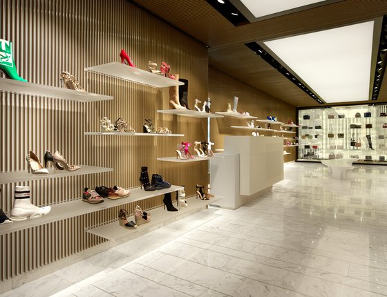
Our goal was to ‘empower’ the shoes by creating an abstract yet seductive setting with a large area of display surface. The designs by Prada, Gucci, Tom Ford and other luxury brands are, after all, quite able to speak for themselves. Placing them on clear yet sandblasted shelves allows them to take centre stage; the transparent sections where the shelves meet the wall make the displays appear to float or levitate, adding a touch of magic.
Passionately practical
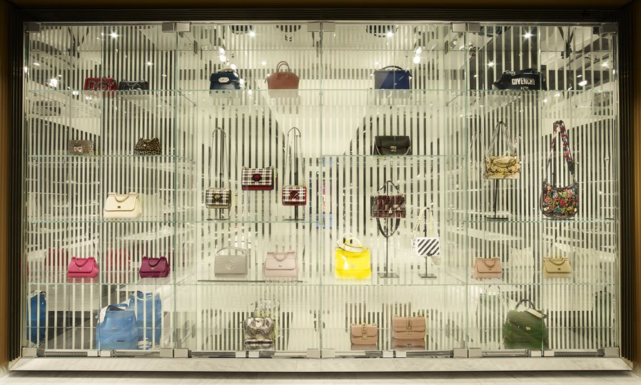
The store measures just 80m2, and our design takes a functional and rational approach in order to make the new interior more spacious than the old one. The cash desk, on the left near the entrance, is compact and linear. Together with the glass display cases behind it and at the rear of the store, it uses space efficiently and does not draw attention from the product display shelves.
On another practical note, the time schedule for the building was the biggest challenge of the whole project: the entire space was completed within four weeks. Together with the contractor Smeulders Interieurgroep, we devised a rapid execution method, designing the walls and ceilings as prefab panels and mounting them in record time – two days ahead of deadline, no less.
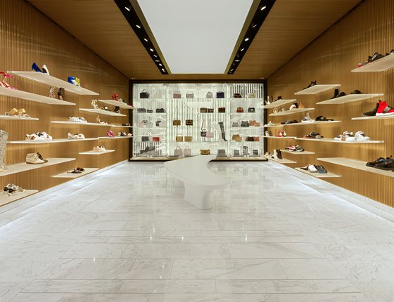
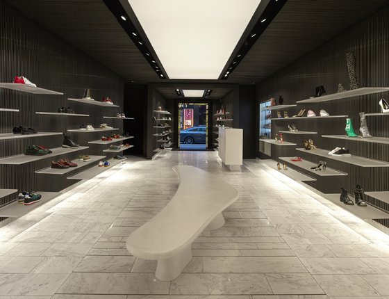
Luxury resurgence
With the PC Hooftstraat’s ongoing makeover, more luxury brands are being attracted to the street: Isabel Marant, Fendi, and Hermès are all expected to arrive before the dawn of 2019. Meanwhile new architectural interventions have upped the architectural stakes. Our new store for Shoebaloo fits perfectly in with these new developments. Above all, it anticipates a new direction for luxury retail in the city: understated rather than OTT, elegant rather than merely opulent and lasting for years.
Factsheet
Shoebaloo PC Hooftstraat
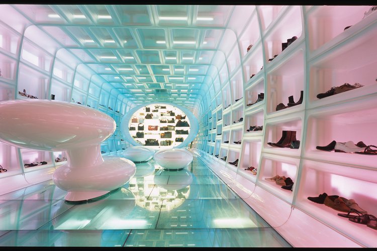
-
ADDRESS
PC Hooftstraat, Amsterdam
-
PROGRAMME
Interior design, retail
-
CLIENT
Shoebaloo B.V.
-
BUILDING SURFACE
100 m2
-
START PROJECT
2002
-
COMPLETION
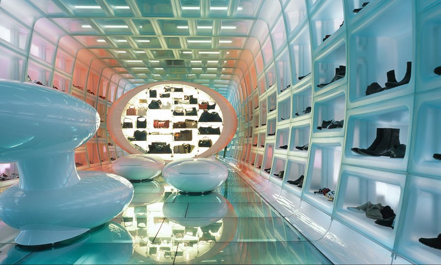
2003
Wall of Fame
NEWS
LIST
NEWS
LIST
Architecture Masterprize
- Winner in Interior Design / Retail
IDA International Design Awards
- Honorable Mention
FRAME Awards 2018
- Longlist Spatial Awards Retail-Multi-Brand Store of the Year
