Project information
-
Location
Amsterdam
-
Project completion
2015
-
Building surface
80 m2
-
Client
Shoebaloo B.V.
Vive la différence
As we see it, a Shoebaloo store doesn’t just sell shoes: it offers its customers a unique experience. The spaces we designed for its flagship are therefore immersive, adventurous environments, with the men’s and women’s boutiques clearly differentiated. Expressing male and female, yin and yang, our stores take opposite yet perfectly complementary approaches.
Opposites attract
In both stores, we used a monochrome palette, allowing the colours of the shoes on show to pop. The men’s store is predominantly white, while the women’s is mainly black, yet a play of black and white, dark and light, features in both spaces, creating a lively dynamic in each separate store and between the two. Similarly, while the men’s store is organic in form, the women’s is more rectilinear, with the elliptical forms of the façades drawing the two together.
White magic
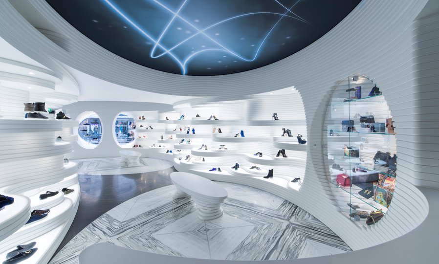
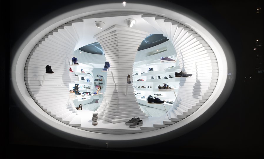
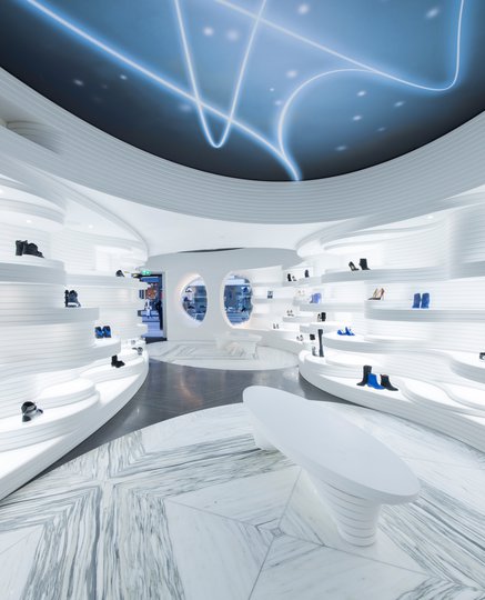
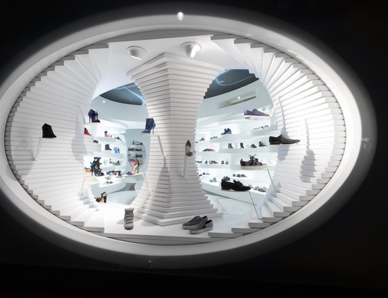
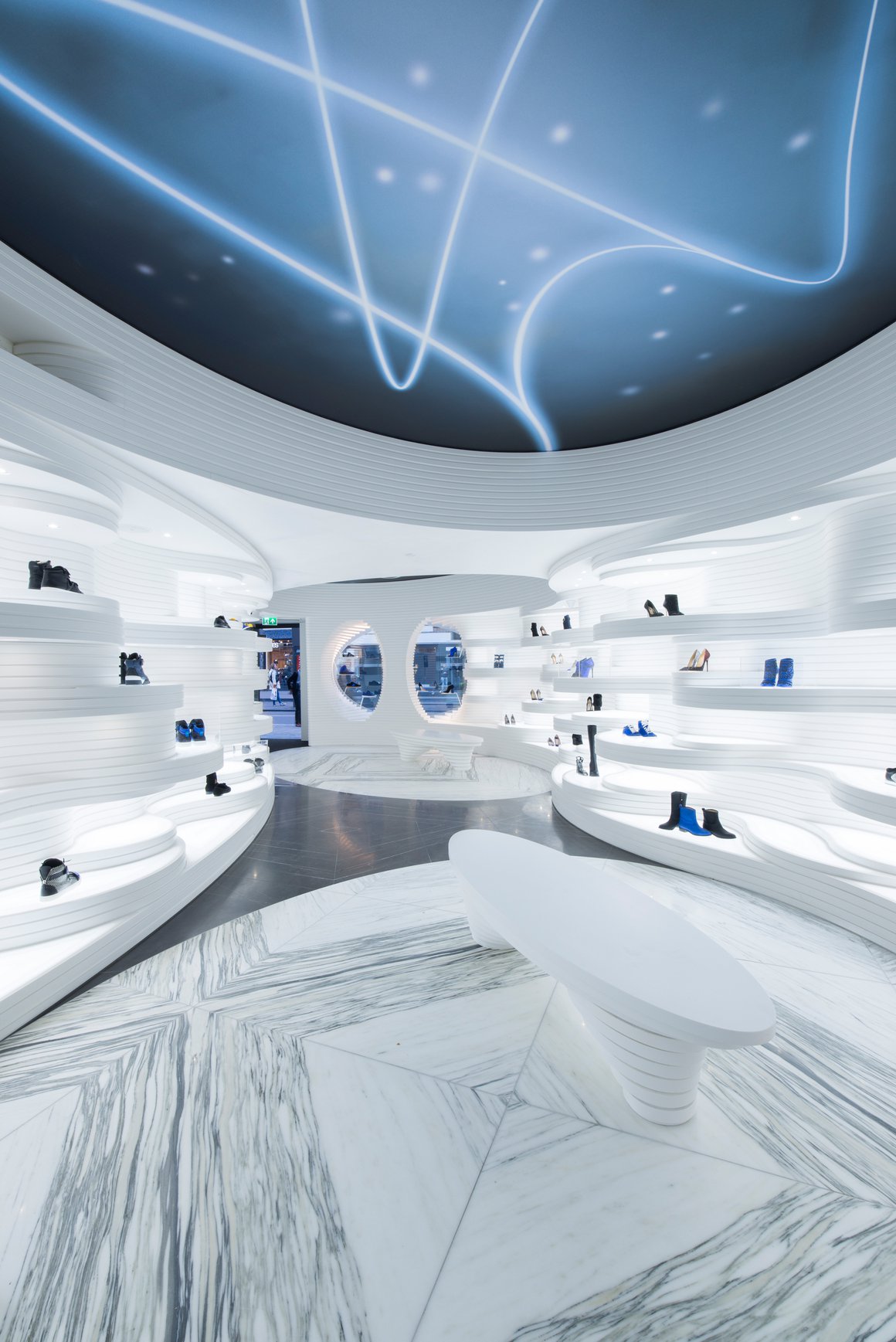
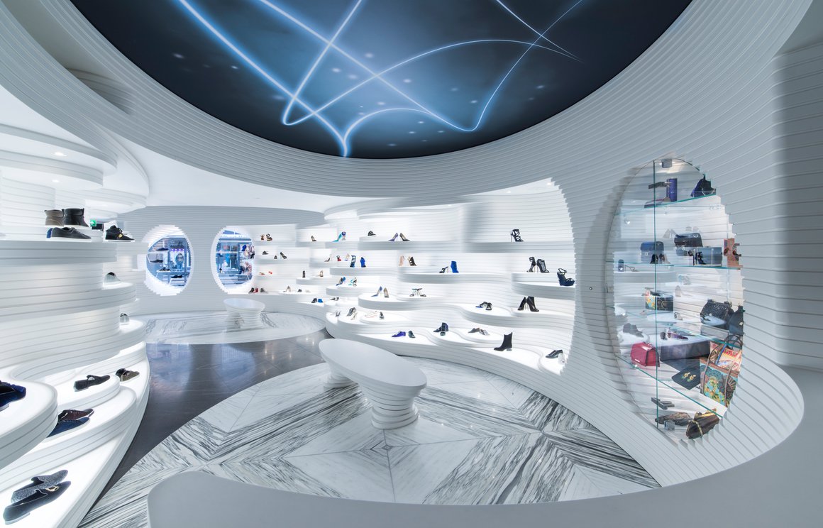
Like a polar landscape beneath a starry sky, Koningsplein 5 is an organically fluid space. While many Shoebaloo stores are closed to the street, enhancing their air of mystery, Koningsplein 5 has a certain transparency. A glass front frames an elliptical bright white display window. This frames two (also elliptical) openings into the store, allowing passers-by a partial view of the interior. At the same time, it acts as a product display, with curving, translucent, illuminated surfaces bringing the shoes up close.
Undulating walls
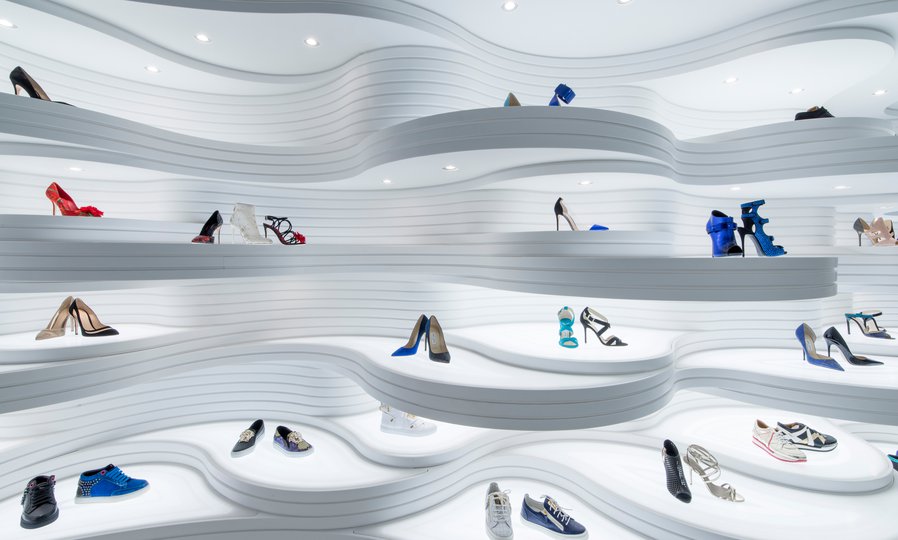
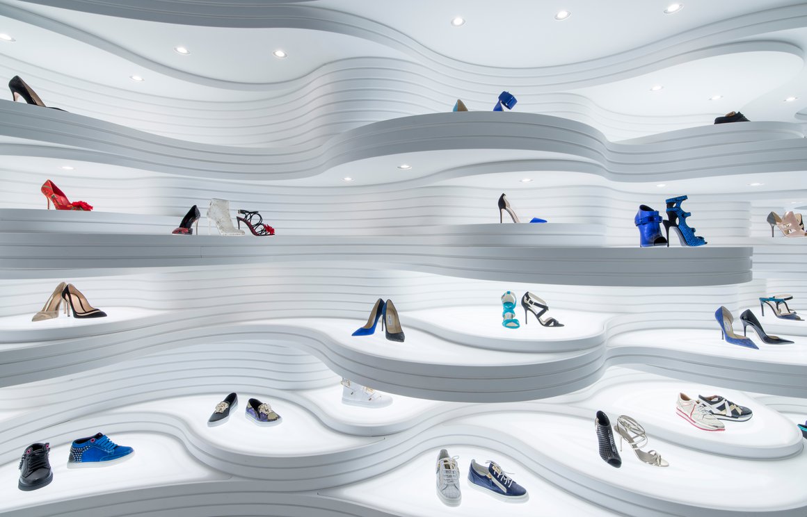
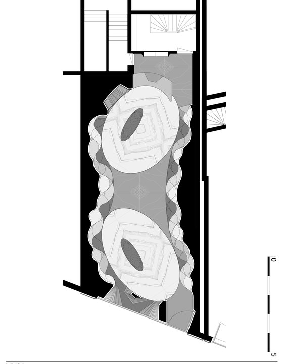
Inside Koningsplein 5, the elliptical theme continues. The space is organised as two ellipses that gravitate towards each other in the centre of the store. Around this floorplan, the walls undulate in a sinuous rhythm of display shelves, all in glowing white Hi-Macs, which is layered to resemble rock strata. At the back of the shop, the counter and a large elliptical display case are integrated into the contours. The freestanding mirrors and seating elements were custom designed for the space, creating a seamless environment.
Marble below, stars above
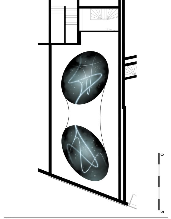
Looking down, the floor of Koningsplein 5 clearly reveals its plan in two ellipses of black-veined white marble. Between them is a middle section of white-veined black marble. Above, two corresponding, dark ellipses on the ceiling feature a pattern of bright, fluid lines that swirl through a starry sky.
Dark matter
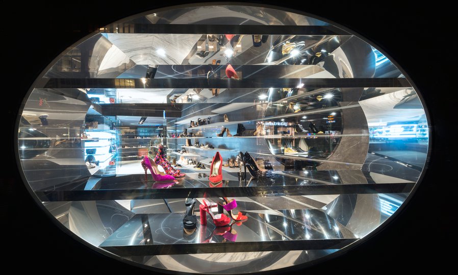
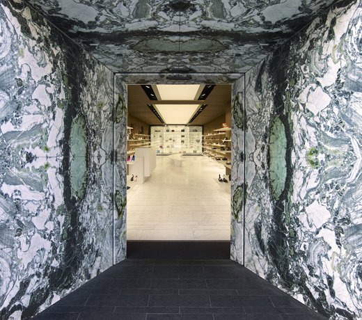
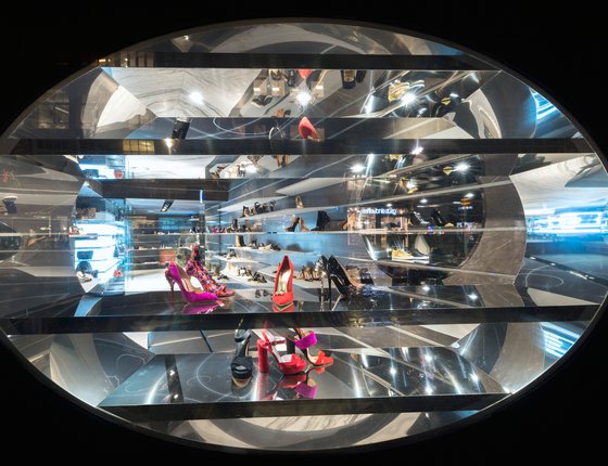
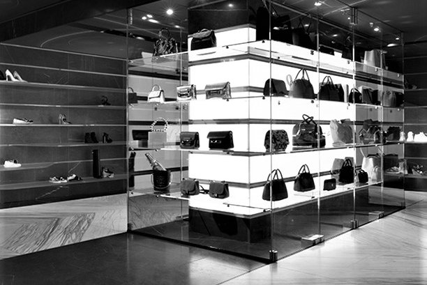
Next door, Koningsplein 7 houses the women’s boutique, signalling it’s relationship with the men’s store by the treatment of its façade, which has two elliptical openings. Inside, dark grey walls and a dark ceiling streaked with glowing white lines create a mysterious and intimate atmosphere. This interior is more rectilinear than its companion, with long, straight shelves in transparent Hi-Macs and a stunning rectangular glass showcase as a centrepiece, displaying bags and other accessories like artefacts in a museum. The floor is white marble with a black marble border.
Elliptical rhythm
From the street, both stores feature elliptical windows, making their relationship to each other obvious at a glance. These openings combine a product window display with tantalising glimpses of the interior. The theme continues on the side façade of the women’s store on the Reguliersdwarsstraat, where a sequence of porthole-like windows continues to invite passers-by inside.
Factsheet
Shoebaloo store Koningsplein 5 & 7-9
-
ADDRESS
Koningsplein 5 & 7-9, Amsterdam
-
CLIENT
Shoebaloo B.V.
-
DESIGN
MVSA Architects
-
CONTRACTOR
Smeulders Interior Group, Nuenen
-
INSTALLATIONS
Wichers & Dreef, Badhoevedorp
-
BUILDING SURFACE
80 m2
-
PROGRAMME
Interior design, retail
-
START PROJECT
2013
-
COMPLETION
2015
