Haga Hospital
-
Location
The Hague
-
Project completion
2015
-
Building surface
34,000 m2
-
Client
HagaZiekenhuis
Single site
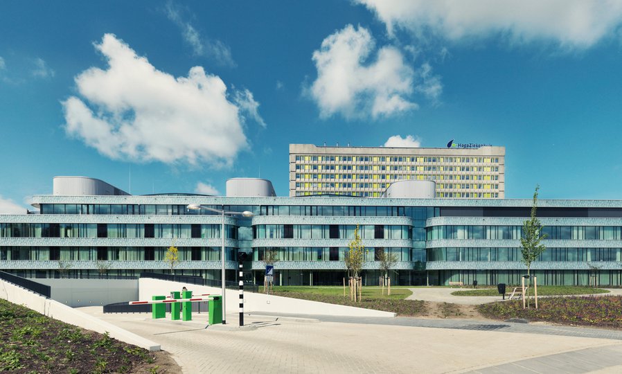
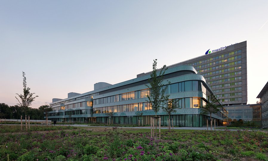
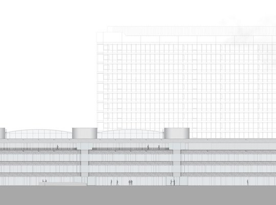
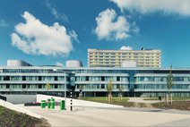
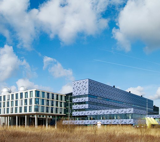
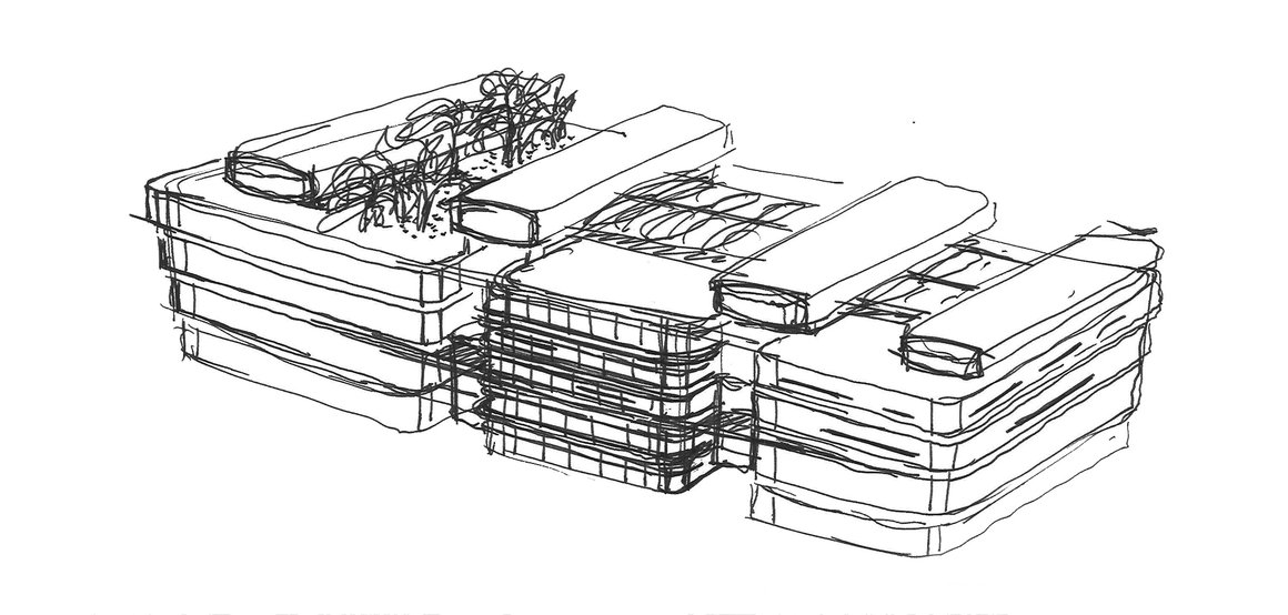
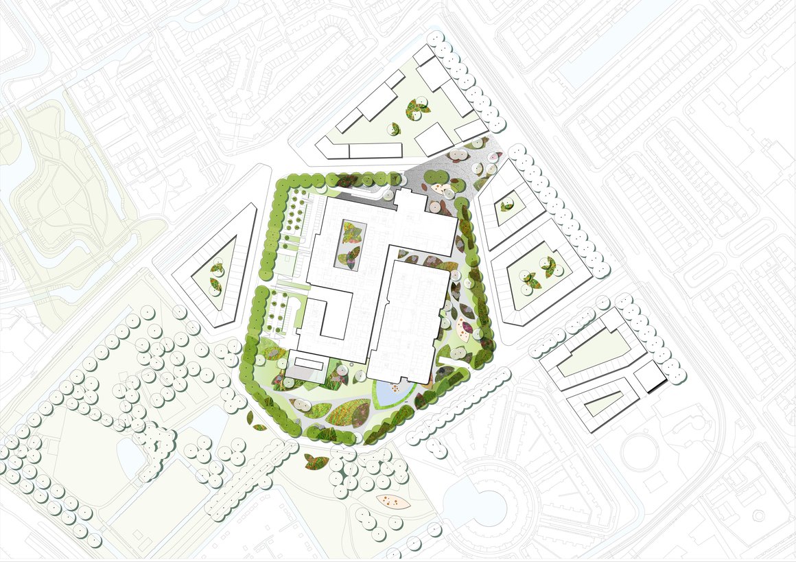
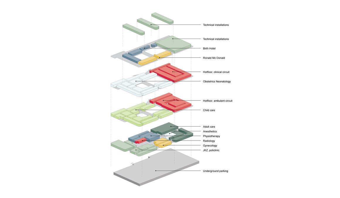
The HagaZiekenhuis is one of the largest hospitals in the Netherlands. The hospital’s outlying regional departments have now been consolidated at a single site. Covering an area of 34,500 m², the new section now accommodates anaesthesiology, oncology, haematology and a day-patient clinic (AOHD), as well as operating theatres, the Juliana Kinderziekenhuis (JKZ) and the Mother & Child Centre.
Planetree
The task put before the VolkerWesselsHaga building consortium was clear. Create a healing environment that enables HagaZiekenhuis to implement its Planetree healthcare philosophy – an approach that aims to provide as many benefits as possible to its patients, visitors and medical staff. For patients, the benefits include faster recovery times, reduced anxiety and stress, and a greater sense of well-being. For staff, the benefits include a more pleasant and efficient working environment aimed at reducing absenteeism and boosting motivation. In other words, a major impetus for the organization as a whole.
Separate flows
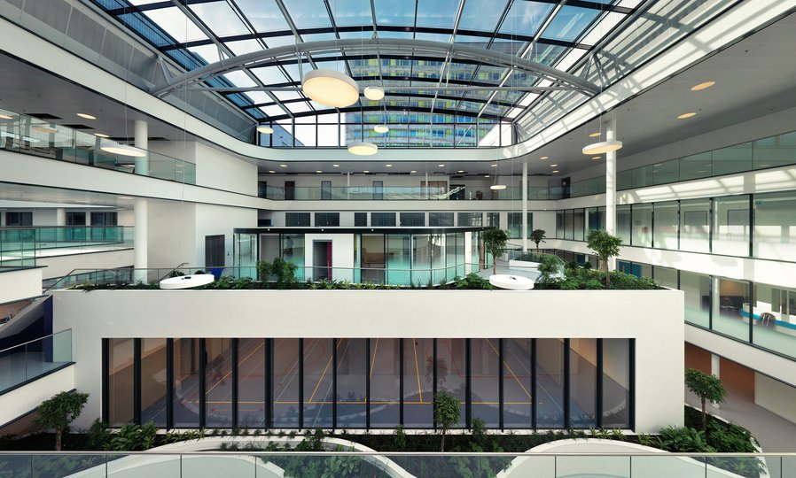
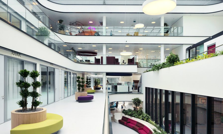
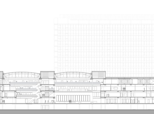
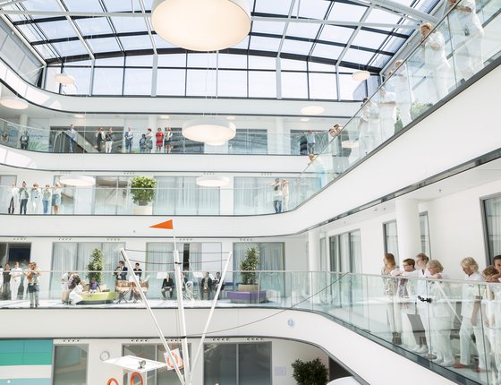
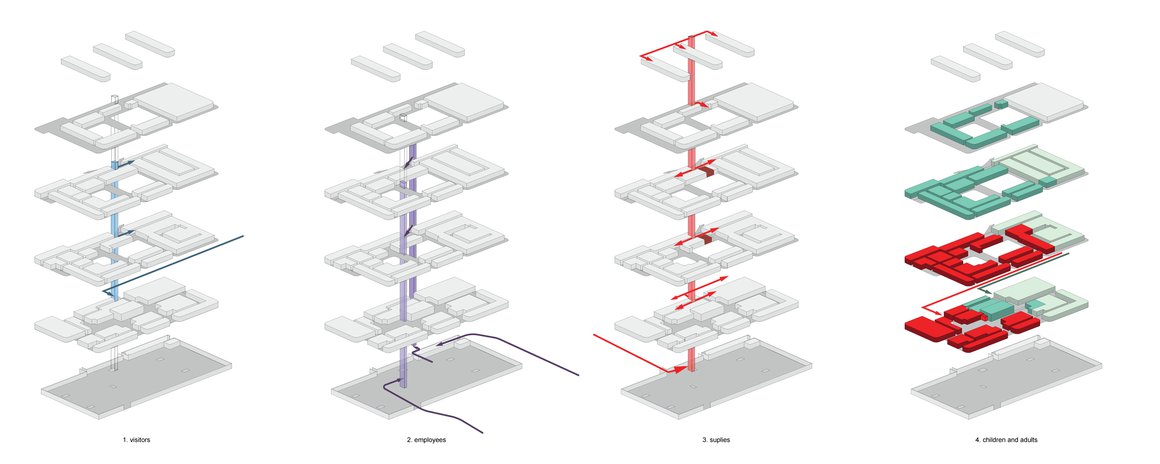
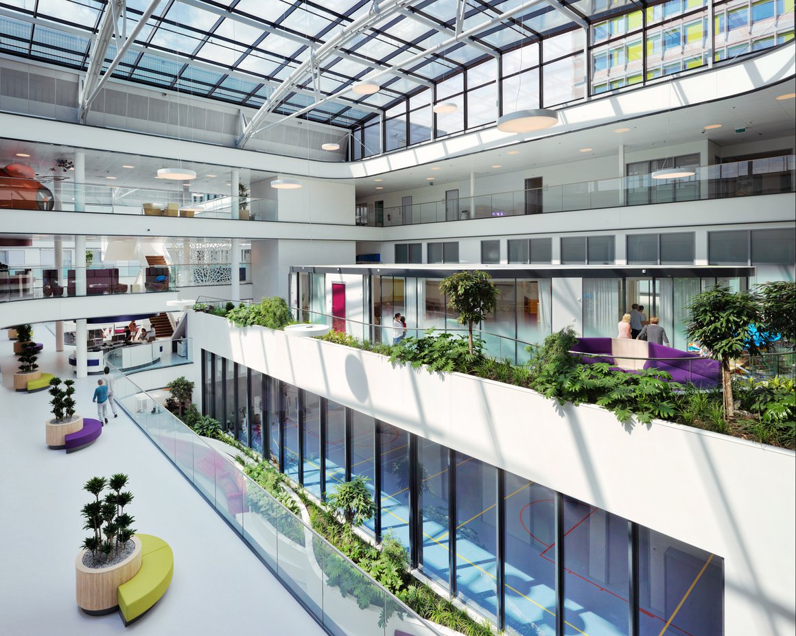
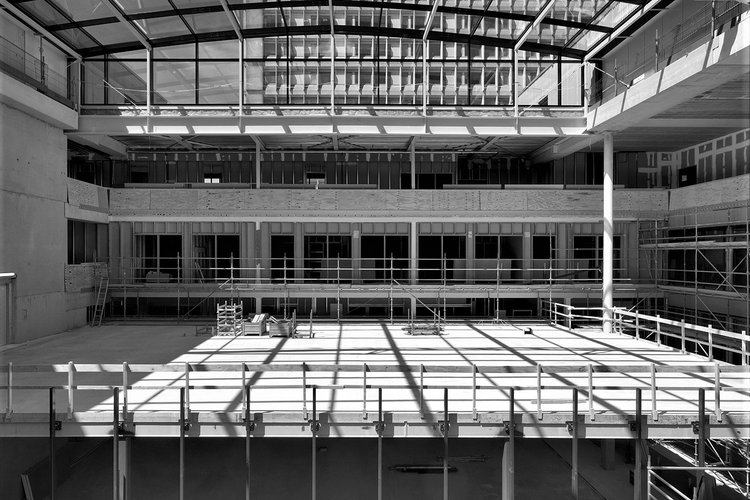
We studied the Planetree approach carefully and as a result opted to focus on the hospital’s logistics as the architectural basis for the design. This entailed separating the building’s various flows. The new building is built in a figure of eight with two landscaped atria on two scales – one for children and one for adults. Walking distances have been kept to an absolute minimum throughout the entire building.
Light & transparency
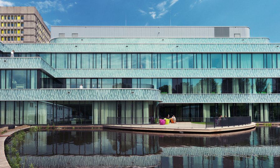
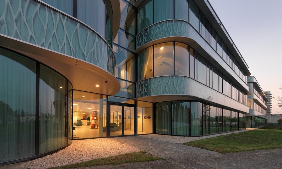
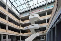
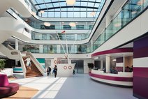
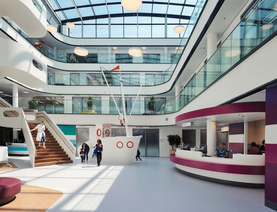
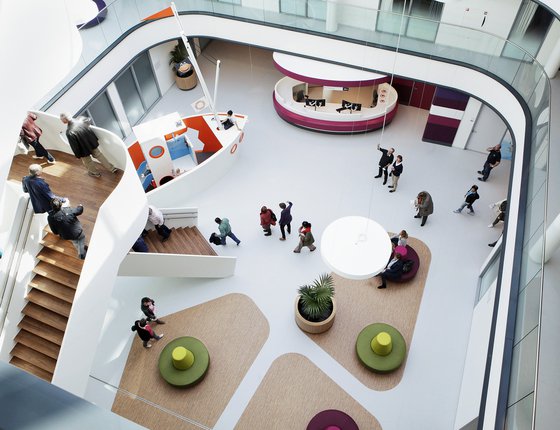
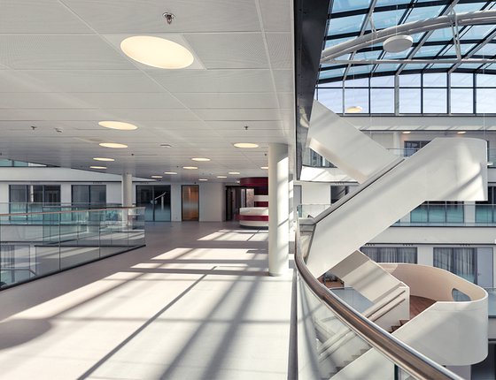
We responded to the logistical challenge of streamlining patient, visitor, staff and delivery flows as efficiently and effectively as possible by creating as much light and transparency as possible in central communal areas. The design is such that wherever you are in the building you can always look outside – either directly or indirectly through another space or room. Both atria have glass roofs.
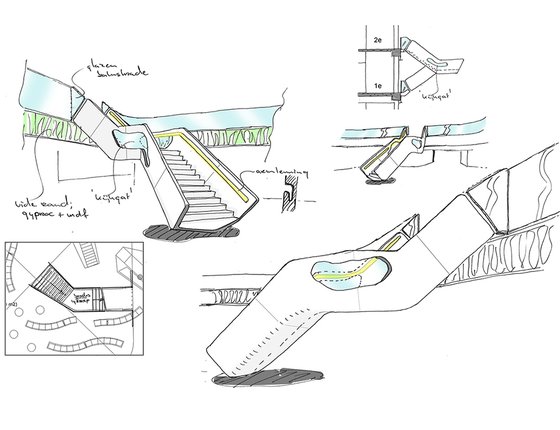
Elevated walkway
The landscaped atria are connected by an elevated walkway. It not only connects in a literal sense, but also figuratively insofar that people from every hospital department can meet and mingle here.
Single rooms
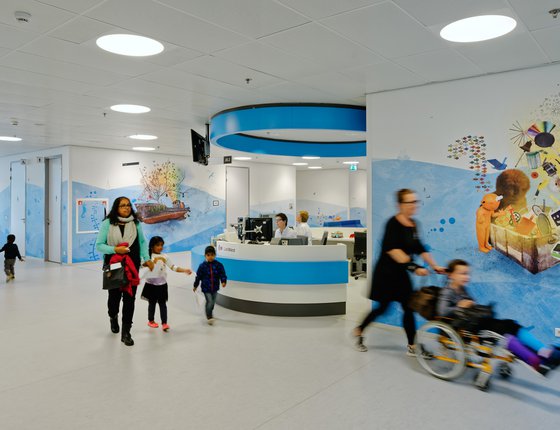
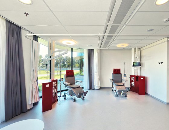
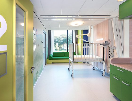
MVSA designed the hospital wards with almost exclusively single rooms to aid and speed recovery. Adult patients always have an outside view and children can always see out into the corridor from their rooms. This helps satisfy their curiosity and allows them to stay in touch with their surroundings. If able, they may always go to the communal play area off ward. So instead of isolation, children are encouraged to meet and play. Equipment, medicine and nursing care simply go with them.
Less stress
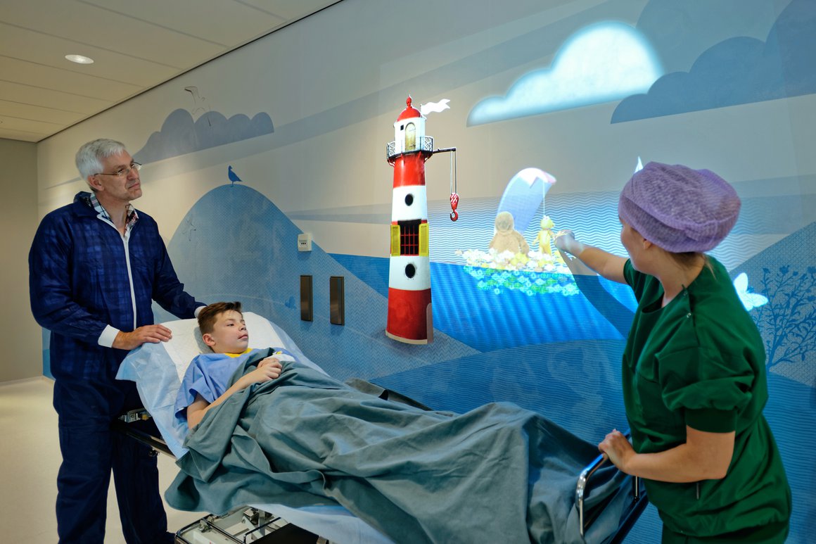
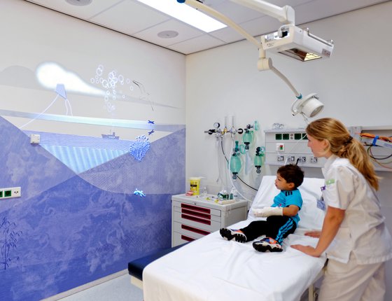
Studies have shown that a child-friendly environment that distracts sick children from their predicament can help reduce stress, anxiety and the perception of pain. This helps them recover more quickly and contributes towards creating a more positive hospital experience. We specifically designed children’s wards to help reduce stress and anxiety levels. MVSA invited experience design agency Tinker Imagineers to create a ‘moving’ storyline for the Juliana Kinderziekenhuis. Five cuddly characters – Hugg, Happy, Fold, C-bot and Fizzle – come to life all around the children in unique, animated wall projections. They accompany children on their ‘adventure’, making them laugh and distracting them from their situation.
User groups
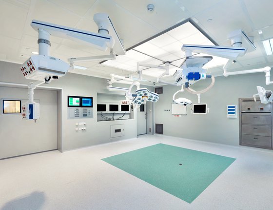
Even during initial brainstorming sessions, it became readily apparent that it was time to say farewell to the stark, enclosed spaces and rooms that traditionally form the basis for most hospitals. Hospital visits and admissions are already stressful enough as it is. It was time for transparency and light. We cleared our agendas and set aside the time to sit down with twenty user groups. We sat with each user group on ten separate occasions for two hours at a time and involved them fully in discussing extremely complex issues. These ranged from logistics to the workability of treatment rooms, from patient room positioning to their exact dimensions and layouts.
Colour
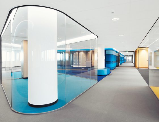
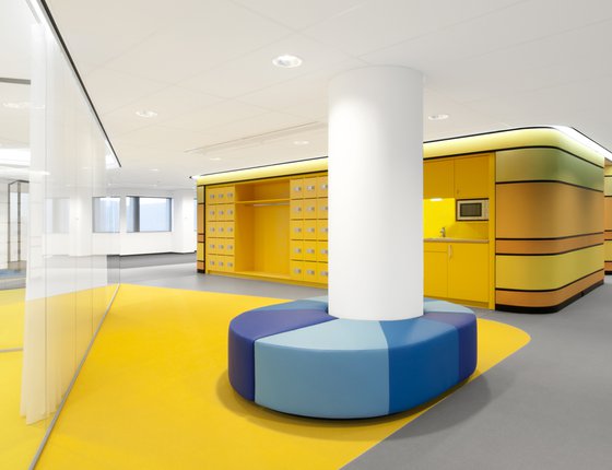
We created a basic neutral palette which is rolled out throughout the total complex. This basic palette, consisting out of different ‘whites’, ‘greys’ and a darker anthracite accent, brings brightness, clearness and tranquility to the environment. To emphasize the identity of each care unit and different specialties like for example radiology, policlinics and anesthesiology, we have added bright and strong colors.
Continuity
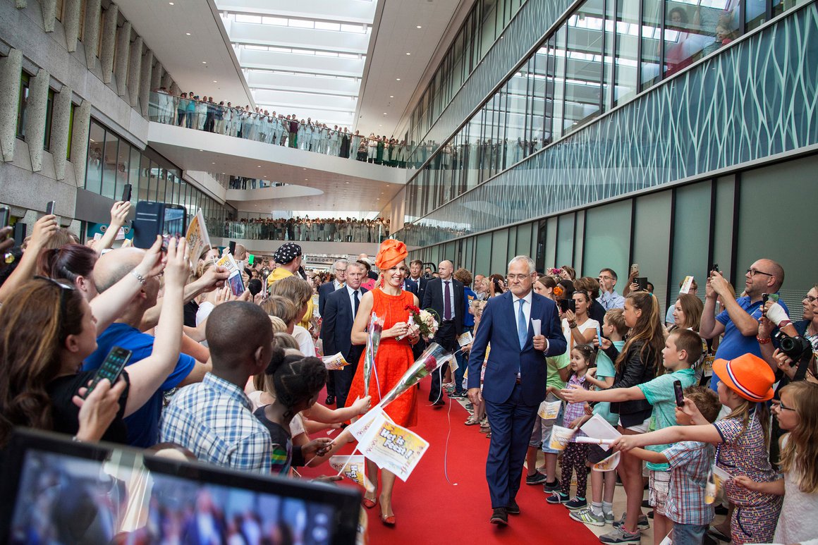
The VolkerWesselsHaga consortium faced several major challenges. One of these challenges was to keep the hospital open during construction work. Other challenges included requirements for accelerated completion times and maximum efficiency levels. It succeeded in every respect thanks to its comprehensive, multi-disciplinary approach. MVSA Architects is proud to be a member of this consortium. Consortium members acted as one, providing HagaZiekenhuis with a single point of contact and relieving it of every conceivable burden. ‘Efficiency’ entailed using ‘vibration-free’ construction techniques, i.e. without pile driving, so as to minimize any nuisance to patients, staff and visitors.
BREAAM-NL Excellent
From the very outset, design work took account of the hospital’s long-term maintenance requirements. Durable materials and smart systems have been used throughout that operate based on natural processes. This culminated in the recent award of BREEAM-NL certification with an ‘Excellent’ rating.
Factsheet
Haga Hospital
-
ADDRESS
Sportlaan 600, 2566 Den Haag
-
CLIENT
HagaZiekenhuis, The Hague
-
DESIGN
MVSA Architects
-
PARTNERS
Consortium VolkerWesselsHaga, existing of: Boele & Van Eesteren, KondorWessels Projecten, Homij bv, Imtech bv
-
BVO
34,000 m2
-
PROGRAMME
Hospital
-
COMPLETION
2015
Wall of Fame
NEWS
AWARDS
NEWS
AWARDS
Architecture Masterprize
- Honorable Mention in Architectural Design
