Project information
-
Location
Amsterdam
-
Project completion
2025
-
Building surface
55.000 m2
-
Client
Boelens de Gruyter
A ‘new’ neighbourhood
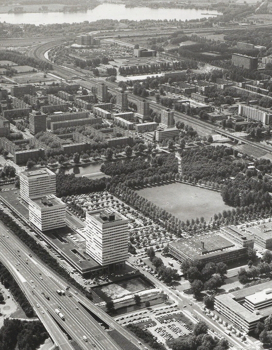
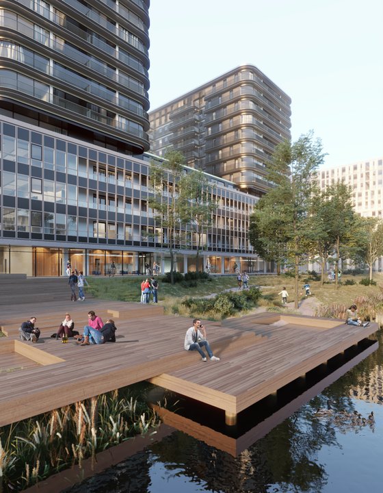
Just outside the A10 ring road, the area around the Koningin Wilhelminaplein, known as Ring Zone West, is currently being transformed into a vibrant live-and-work neighbourhood with ever closer connections to the historic centre of Amsterdam. The master plan, by KCAP Architects & Planners, combines office space, new homes and all kinds of public facilities that will add fresh energy to the neighbourhood. New building will increase the usable volume above ground level from 33,000 to 90,000 m2. Meanwhile parking will be confined to underground garages, creating space for a public square and abundant greenery, with everything linked by bridges and walkways. In short, Amsterdam will gain a beautiful ‘new’ neighbourhood.
Functional foundations
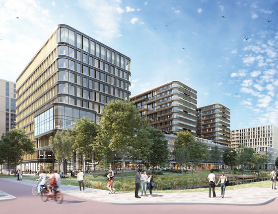
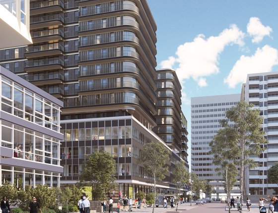
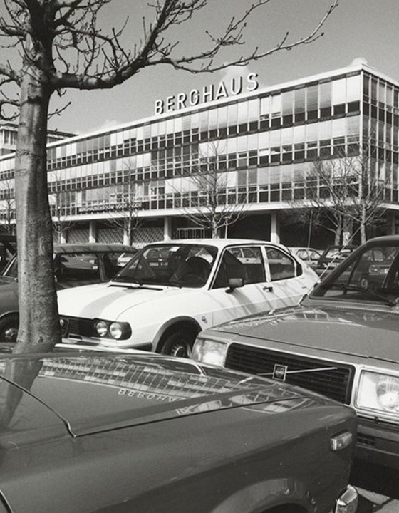
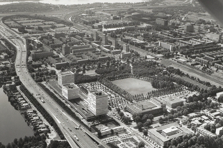
Part of the master plan is the ensemble consisting of Berghaus Plaza, The Fashion House and Modrôme, three office buildings opposite the World Fashion Centre - itself an important Amsterdam landmark that MVSA is also refurbishing. Berghaus Plaza is the site of the coming 600 new homes. A functional structure designed by Johannes van Herweden, it was built in 1964 for clothing producer f H. Berghaus N.V. The current state of the office building is virtually unchanged from its early days, down to the car parking area. The original simple, rational expression shines through.
Stack it up
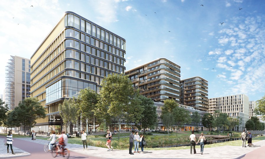
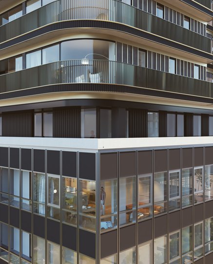
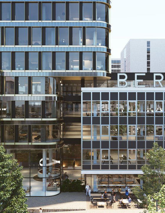
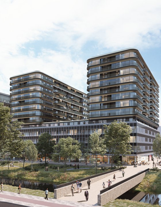
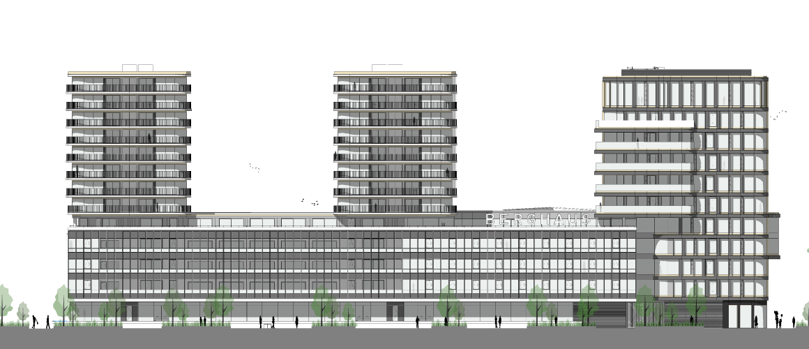
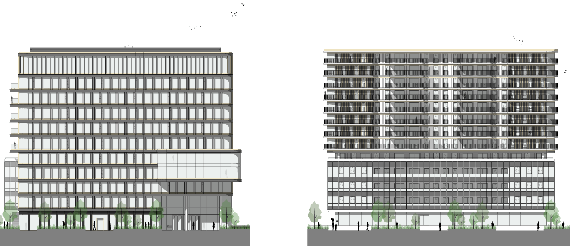
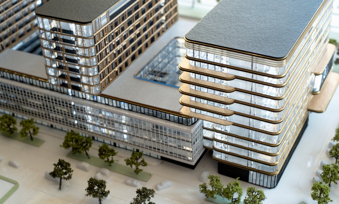
Together, MVSA Architects and Heyligers d+p have designed two residential towers that will form the generous ‘topping’ of the existing Berghaus Plaza, plus an office tower of 11 storeys, which will stand on the east side of the original development. The challenge for the designers was to retain the keynotes of the original building, based on the functionalism of the 1960s, while giving it a fresh, contemporary look.
A serene statement
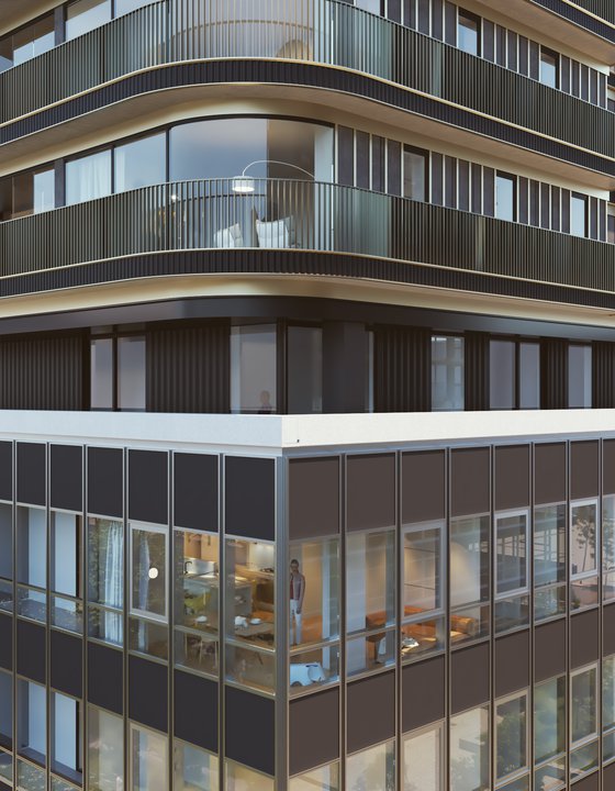
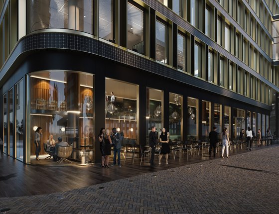
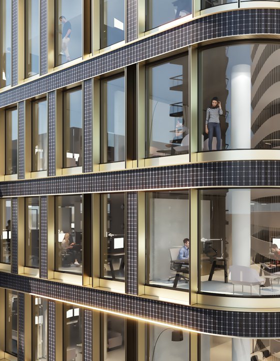
Partially demolishing the existing building adds much-needed light and space to the design. The existing façade, in poor condition, will be replaced by a stylish and luxurious modern version that echoes the rhythm and detailing of Johannes van Herweden’s original design. To offset the functional simplicity of the building, MVSA and Heyligers d+p have added elements of irregularity, plus some organic curves and chic, contemporary materials. This combination of harmony and contrast in the relationship between old and new adds dynamism and interest to the design.
Amsterdam School revisited
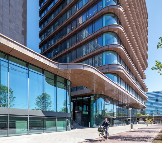
The total building complex will speak one formal language, with an emphasis on the horizontal craftsmanship of the famous early 20th-century Amsterdam School, known for its expressionist residential brick buildings. The design becomes contemporary through the combination of chic black ceramic and gold-bronze aluminum, which generates a feeling of luxury. That atmosphere is amplified by the elegant rounding of the corners – a typical feature of the Amsterdam School, here translated into 21st-century materials.
Landmark living
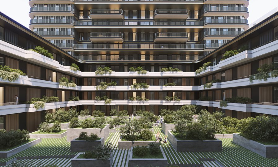
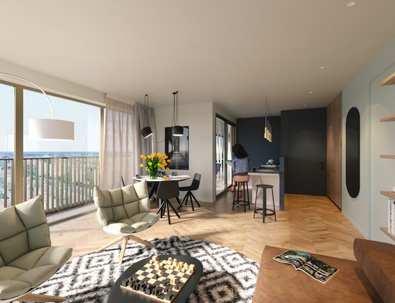
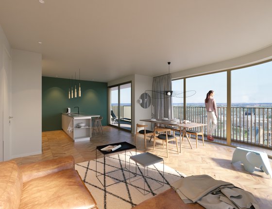
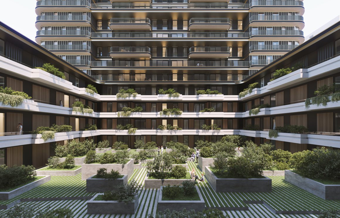
The new homes share a fresh, clearly articulated profile. The open entrance space flows naturally into the courtyard, around which the façade rhythm is consistently repeated. Here however the façade is completely white and features an overhang, accommodating the balconies, in contrast to the rest of the ensemble. A viewing garden ensures residents’ privacy as well as supplying beautiful green views. It forms a landmark and also makes a wonderful meeting place.
Social at heart
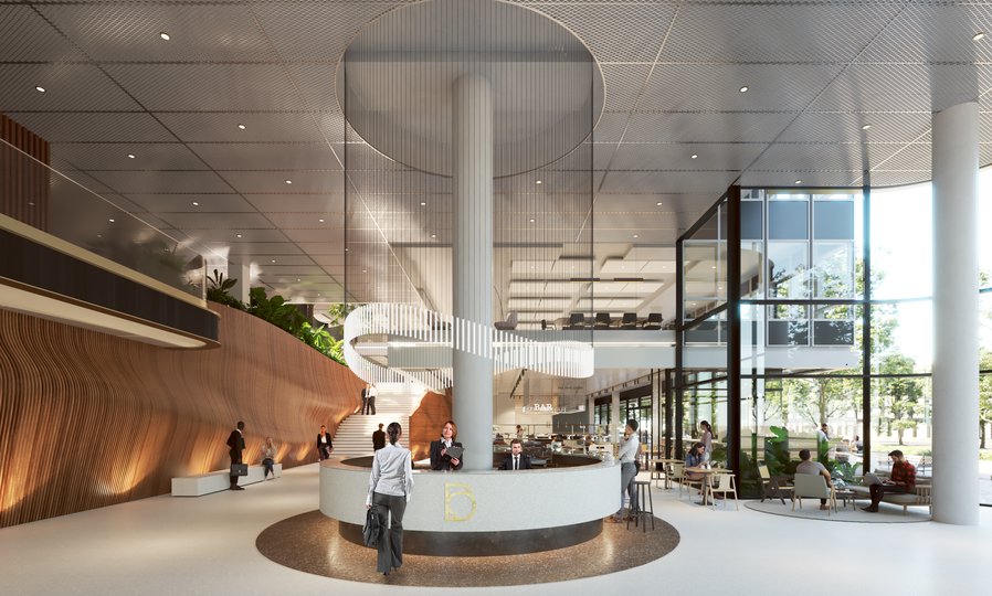
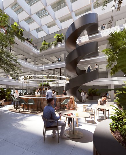
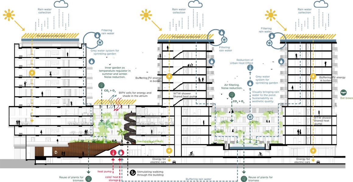
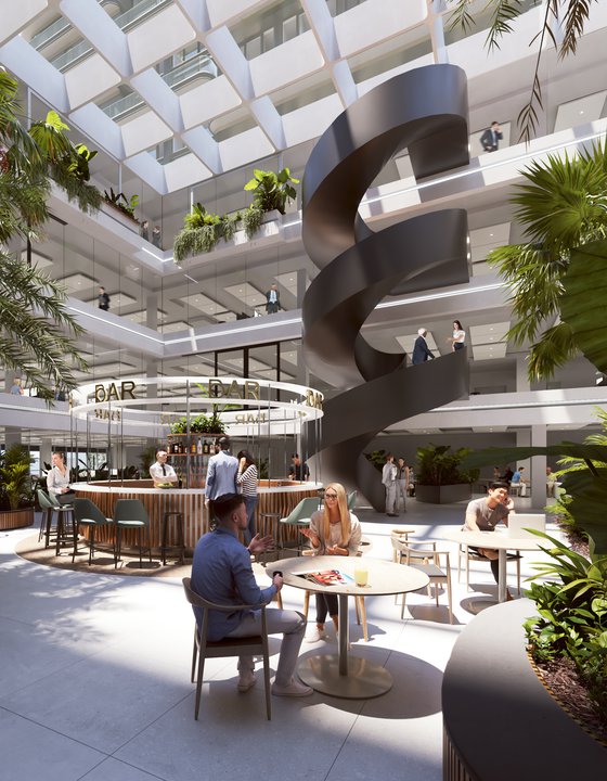
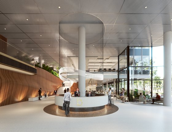
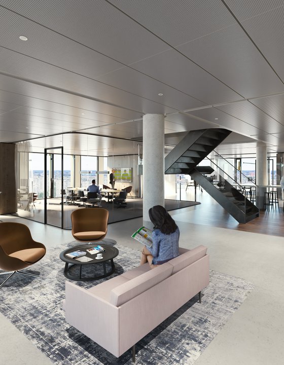
The office spaces share a generous entrance that makes both employees and guests feel welcome. This space flows into the glass-covered atrium. A sculptural staircase is an eye-catcher and leads people naturally into the atrium. The staircase links together a chain of ‘islands’ that make optimal use of the atrium space and provide connection and orientation points. Workspaces are clustered around the atrium, while the multi-functional islands offer spaces to meet or host an event. The heart of the light-filled atrium is a social space.
Outside in
Each floor of the office building has an outdoor space. Balconies are located on the south façade. These also serve as sun protection, preventing the offices from overheating. The top floor has an extensive sun lounge that runs across its entire width, adding lots of possibilities for tenants and providing a further touch of luxury. Another sun lounge accentuates the entrance and offers great views. On the ground floor, a canopy shelters further outside spaces, including a kiss & ride.
Mind the gap
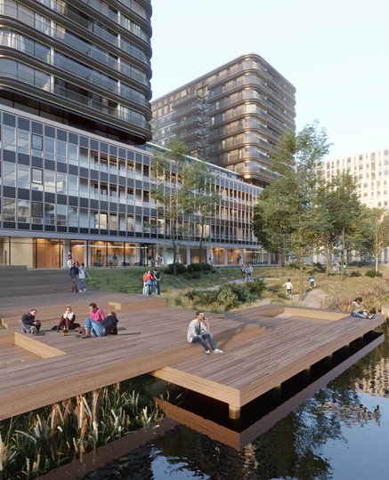
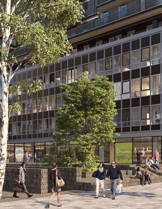
The gaps in the design are used to provide public areas. Apart from the houses and offices, a city garden, central plaza, street and waterfront will be realized. These public spaces will be located on an elevated deck and will be accessible to all.
Factsheet
Berghaus Plaza
-
CLIENT
Boelens de Gruyter, Amsterdam
-
DESIGN
MVSA
-
CONSTRUCTION
Van Rossum, Amsterdam
-
BUILDING PHYSICS
Nelissen ingenieursbureau, Eindhoven
-
BVO
60,000 m2
-
VVO
54,000 m2
-
PROGRAMME
Mixed use (Offices, Residential and Retail)
-
DESIGN
2020
