Project information
-
Location
Amsterdam
-
Project completion
2024
-
Building surface
-
Client
Flow Real Estate
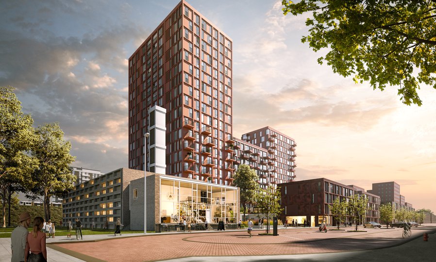
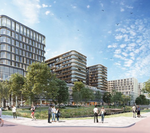
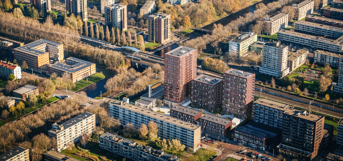
Anticipating future needs, the City of Amsterdam is transforming Slotervaart, a 1950s suburb, into a ‘densified’ urban city district. MVSA’s Ottho is part of this ongoing metamorphosis. The new development adds a lively metropolitan ensemble of five buildings and a square (the Vivigplein) to the Staalmanplein neighbourhood, combining apartments with offices, retail, leisure and public space. Ottho adds the last puzzle piece to the so-called Parade strip along the railway line: it acts as both an endpoint and an entrance to the area. Finally, it creates a new public identity for a Modernist protected monument, the former Amsterdam-Slotervaart telephone exchange, located on the corner of the Plesmanlaan and Otto Heldringstraat.
Space to breathe
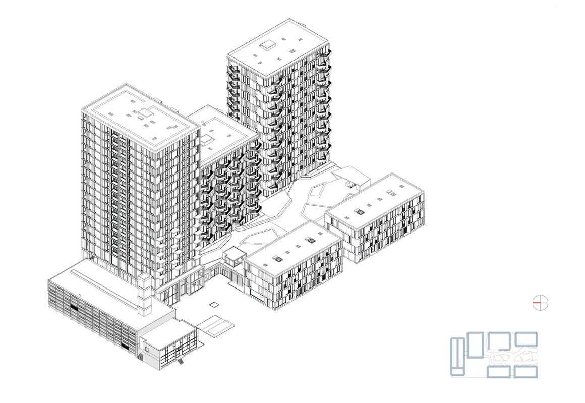
Ottho very nearly had no plaza. The original plan for the site, occupying a corner of the Staalmanplein neighbourhood, called for six blocks of varying height – three taller blocks next to the canal and railway line, and three lower blocks on the Otto Heldringstraat. These would accommodate the varied programme, including much-needed affordable starter homes, but there were two drawbacks: the telephone exchange, at the end of the site, would have been being hemmed in by the new development, and there was no public space to compensate for the density of the development on the compact site.
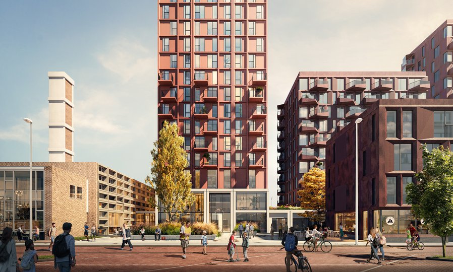
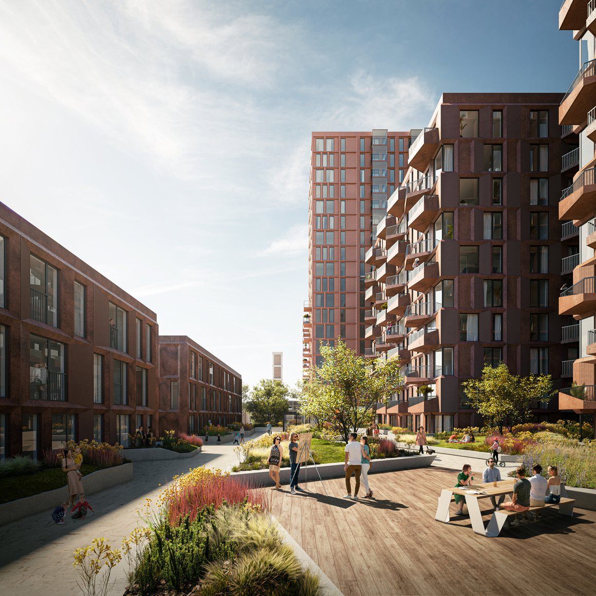
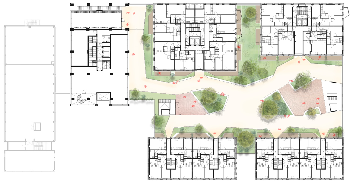
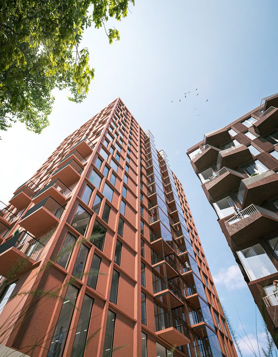
MVSA’s solution was to add a square next to the telephone exchange by taking one of the three low blocks and placing it on top of a taller one. This intervention results in five buildings, instead of six, creating a tower nearly 70m high and opening up the space to create a plaza. The telephone exchange gets space to breathe, and the community gains a lively public square next to this local landmark: a place for people to meet, or just enjoy being outdoors. Entrances to the café, offices and apartments all cluster around the plaza, ensuring a vibrant atmosphere. The tower meanwhile adds a metropolitan accent and is perfectly situated to continue the rhythm of the other towers in the Parade, anchoring the new development in its context.
Unplugged but connected
The 1959 telephone exchange is a fine example of Dutch mid-century Modernism – and was therefore listed as a monument in 2008. It features a distinctive geometric concrete frame design, and an eye-catching abstract sculpture by Lotti van der Gaag hangs on its façade. In its new life, the building will house a café and offices. Its history, as a communications facility, inspired our addition of the Vivigplein – a space for connection. Although the exchange is now unplugged, it can still connect others, and remain connected itself, via the new public square.
The bold lines and materiality of the exchange building also inspired the architecture of the Plesman Plaza. We adopted its frame grid for our own façades, creating eight different geometrical frames that subtly reflect and reinforce each other. We placed all these on a continuous concrete plinth, again inspired by the telephone exchange. The plinth also echoes the 1950s building’s play of open and closed forms. The choice of concrete as the main building material is another nod to the earlier structure.
Red for warmth
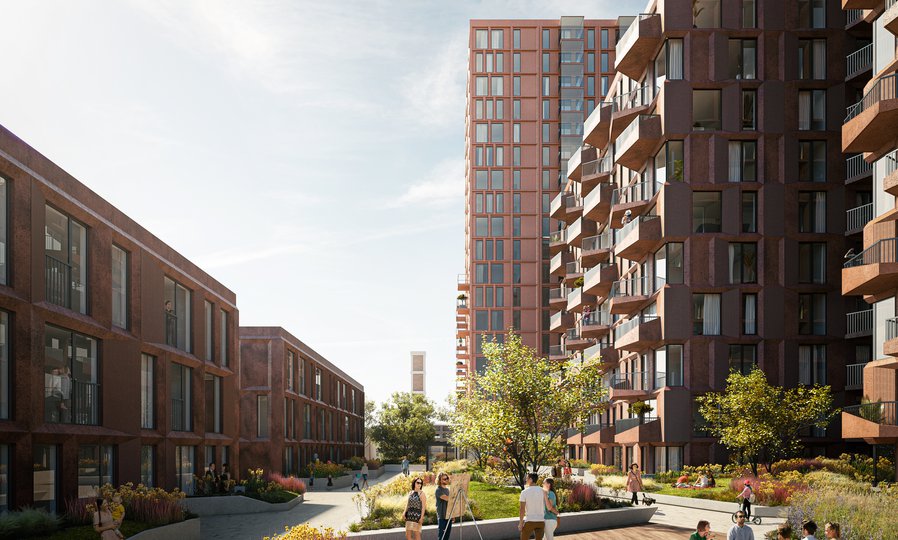
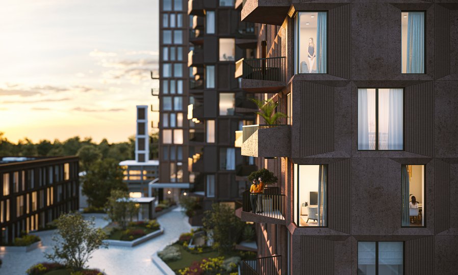
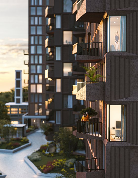
A second inspiration was the 1950s residential architecture of the nearby Staalmanplein by Keesman and Staal, in particular the playful use of angled balconies. We adopted these oblique outside spaces for the apartments of the Plesman Plaza. They create visual interest, with an intriguing play of light and shadow that changes throughout the day, and they also have a practical function in helping to ensure that every apartment gets sufficient daylight.
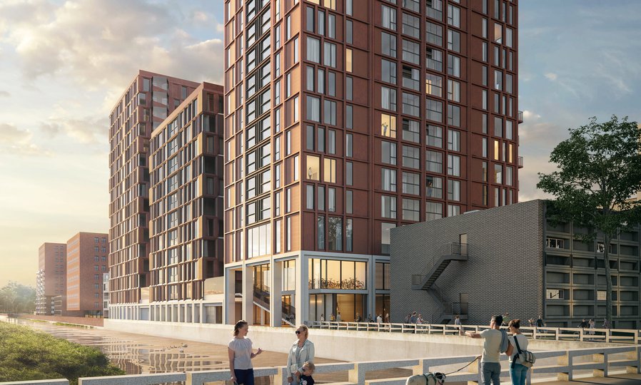
While much of the surrounding architecture is in red brick, we opted for red concrete as our base material – giving our buildings a contemporary yet classic look. The various shades of deep red add warmth to our design and create a pleasing variation in the five buildings. The different geometric façade grids achieve the same effect, creating differentiation while sharing a family resemblance. All these variations help to create a richly detailed design that we intend to age as well as those of the exchange and the Staalmanplein. The tower strikes a different note, straddling a middle way between the expressive angular balconies and the more rational, corporate architecture of other city towers. With its sleek form and extra height, the tower forms an emphatic end to the Parade.
Secret garden
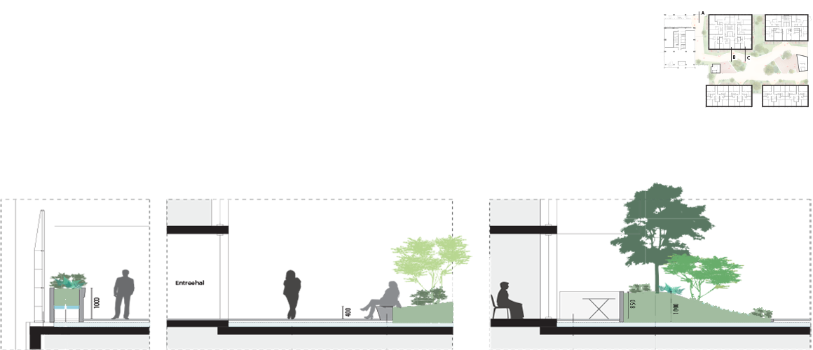
Since the site has a small footprint and the apartments are compact in size, we provided an extra outdoor space in the form of a private inner garden between the blocks. This is only accessible to residents. Built on top of the deck roofing the ground-level carpark, the garden has abundant greenery, a play area for children, and pavilions housing outdoor kitchens and barbecues. Since there is noise from the road and railway, the balconies are all oriented towards this peaceful garden, or towards the square.
Another area of public space – the path next to the water – was in urgent need of a revamp. Our design turns the dark, uninviting, unloved area into a feature by extending it and adding landscaping and more lighting. Placing the bicycle parking facility here ensures constant traffic to the area from the street, and so brings new life to it.
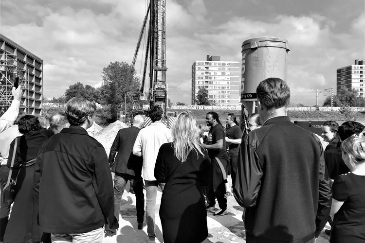
Construction on the Plesman Plaza is expected to start later this year.
Factsheet
Plesman Plaza, Amsterdam
-
ADDRESS
Ottho Heldringstraat 3-5, 1066AZ, Amsterdam
-
CLIENT
Plesman Plaza B.V. Amsterdam
-
DESIGN
MVSA Architects
-
CONSTRUCTION
Van Rossum
-
INSTALLATIONS
Arcadis
-
ACOUSTICS
Peutz
-
CONTRACTOR
SBB Smits Bouwbedrijf
-
BVO
33.000 m2
-
PROGRAMME
Residential, commercial, parking
-
START CONSTRUCTION
2022
-
COMPLETION
2023-2024
