PVH Campus
-
Location
Amsterdam
-
Project completion
2018
-
Building surface
33.000 m2
-
Client
Heren 2, PVH Europe
Variations on a theme
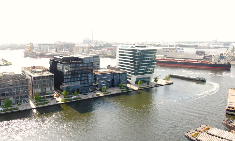
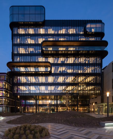
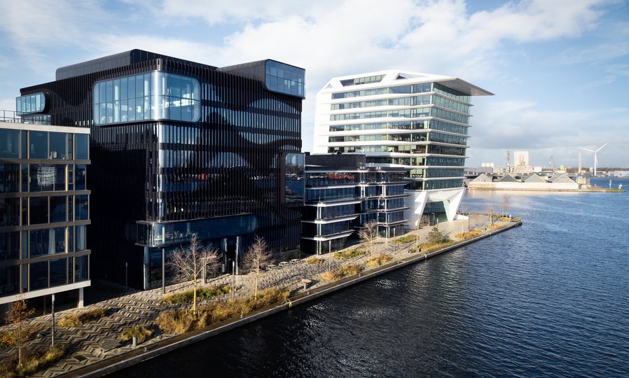
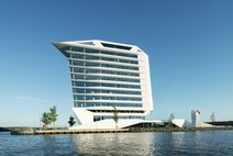
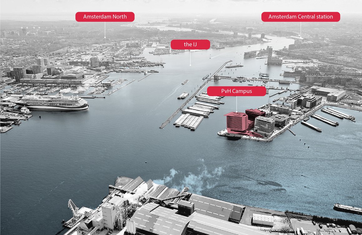
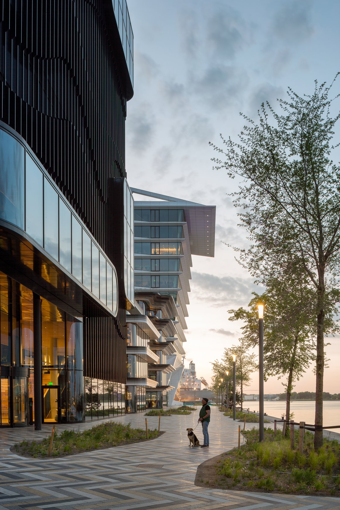
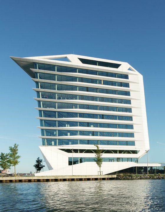
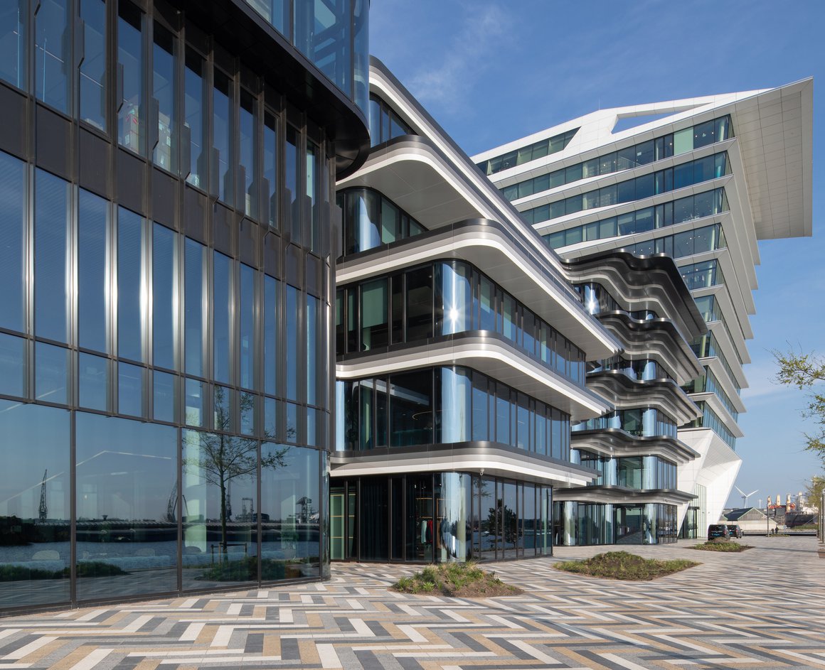
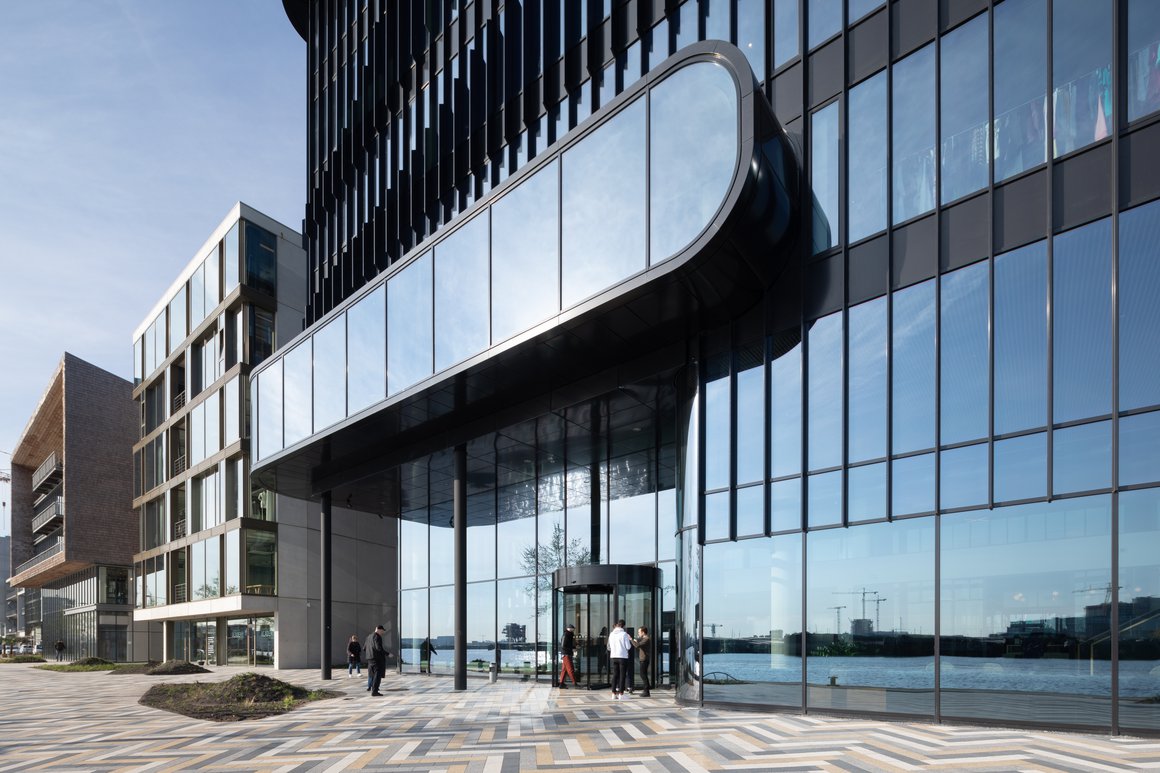
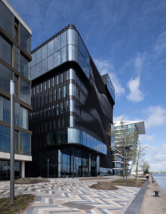
A maritime setting suggests a variety of associations, so to underline the shared yet separate identity of the three buildings, we interpreted it in three different ways. The European HQ Calvin Klein & Tommy Hilfiger building, the first to be completed, has the sleek lines and shiny finishes of a sailing ship. The middle, low-rise building, the social hub of the campus, has a stratified yet flowing form inspired by a waterfall. The third, a high-rise office complex, has a graphic façade that reflects the movement of waves.
Signature statement
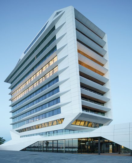
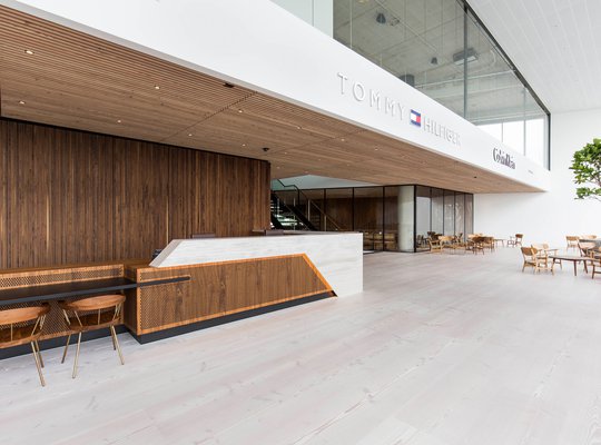
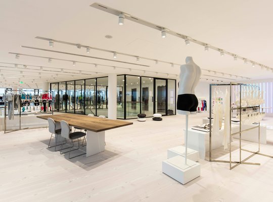
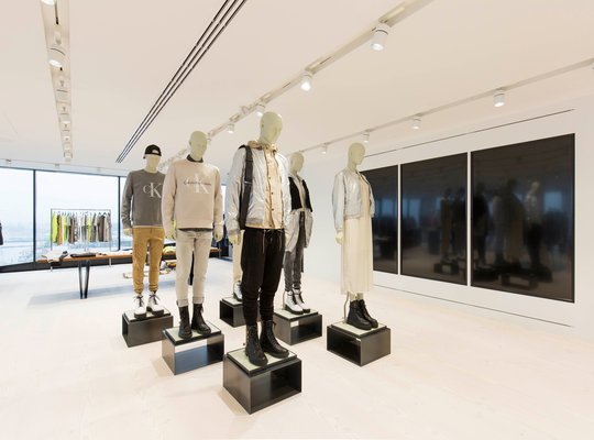
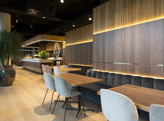
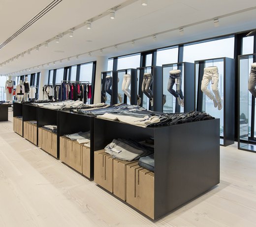
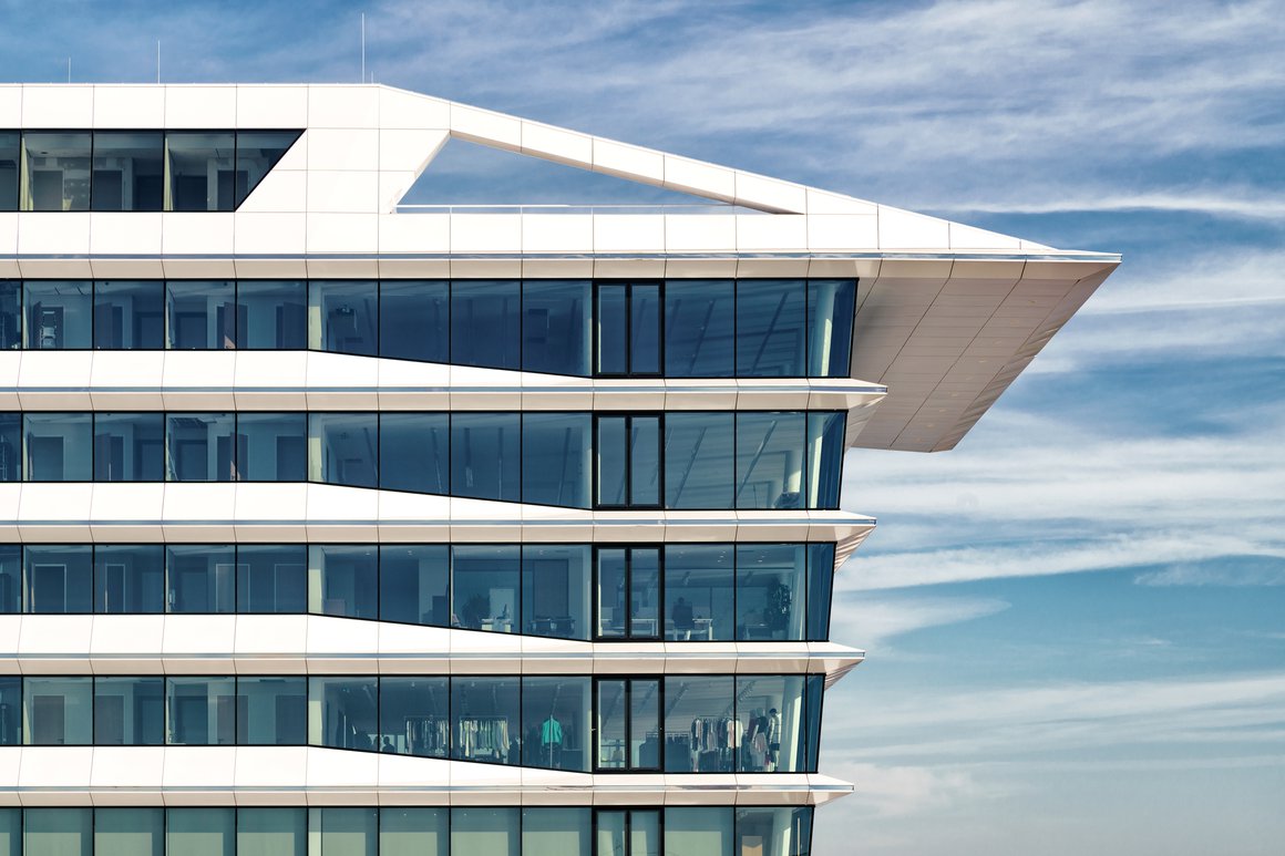
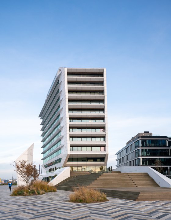
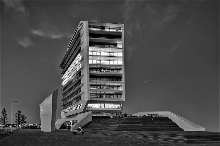
The European HQ are Calvin Klein’s and Tommy Hilfiger’s public face in Amsterdam, the place where the brand showcases its collections and welcomes clients from all over Europe. Its height and iconic form give the campus an easily recognizable presence and identity, as well as contributing to the new series of stunning landmarks on the IJ waterway. The 12-storey building is designed to house showrooms, offices and a restaurant and is crowned by an impressive roof terrace.
A sociable heart
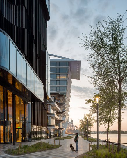
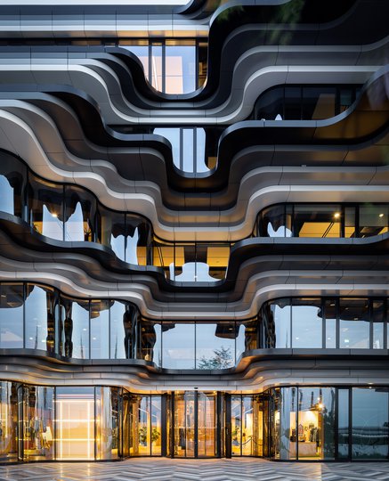
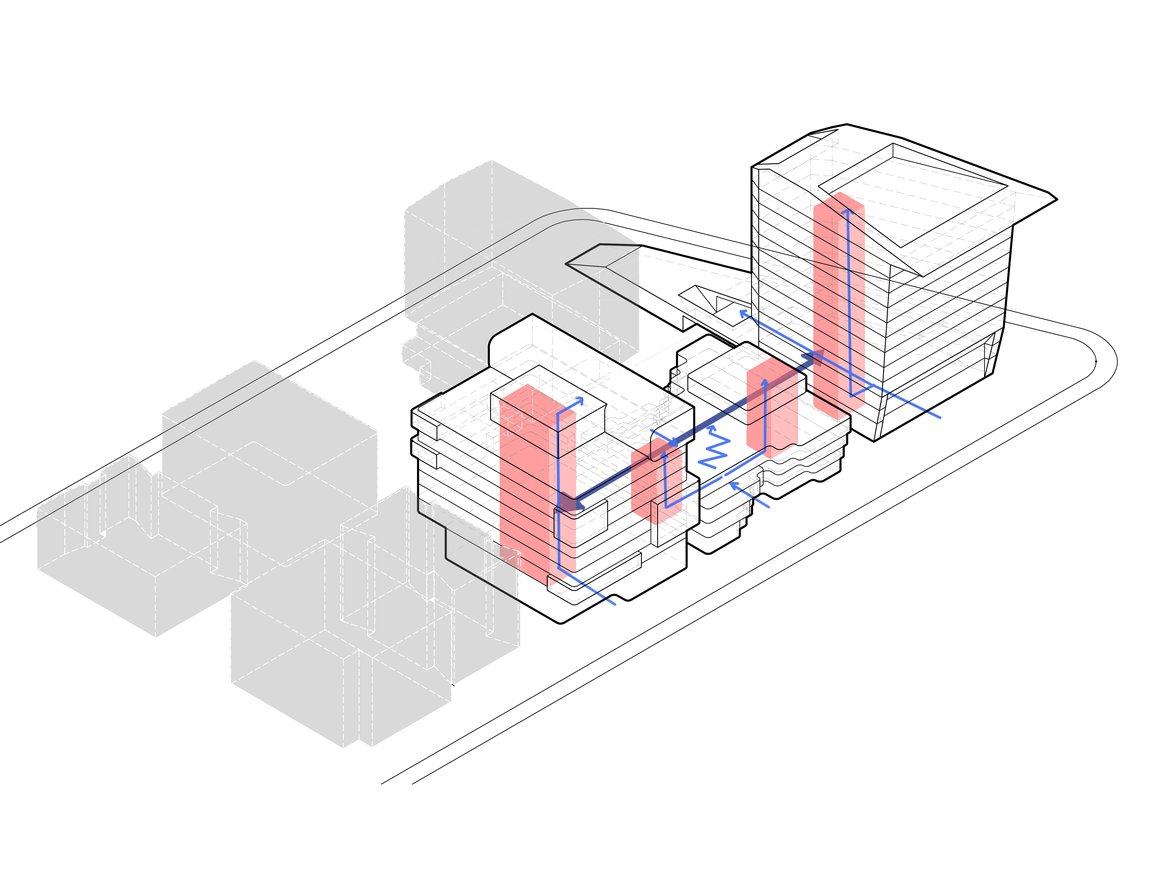
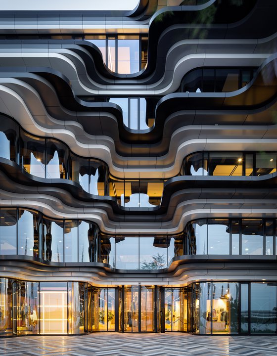
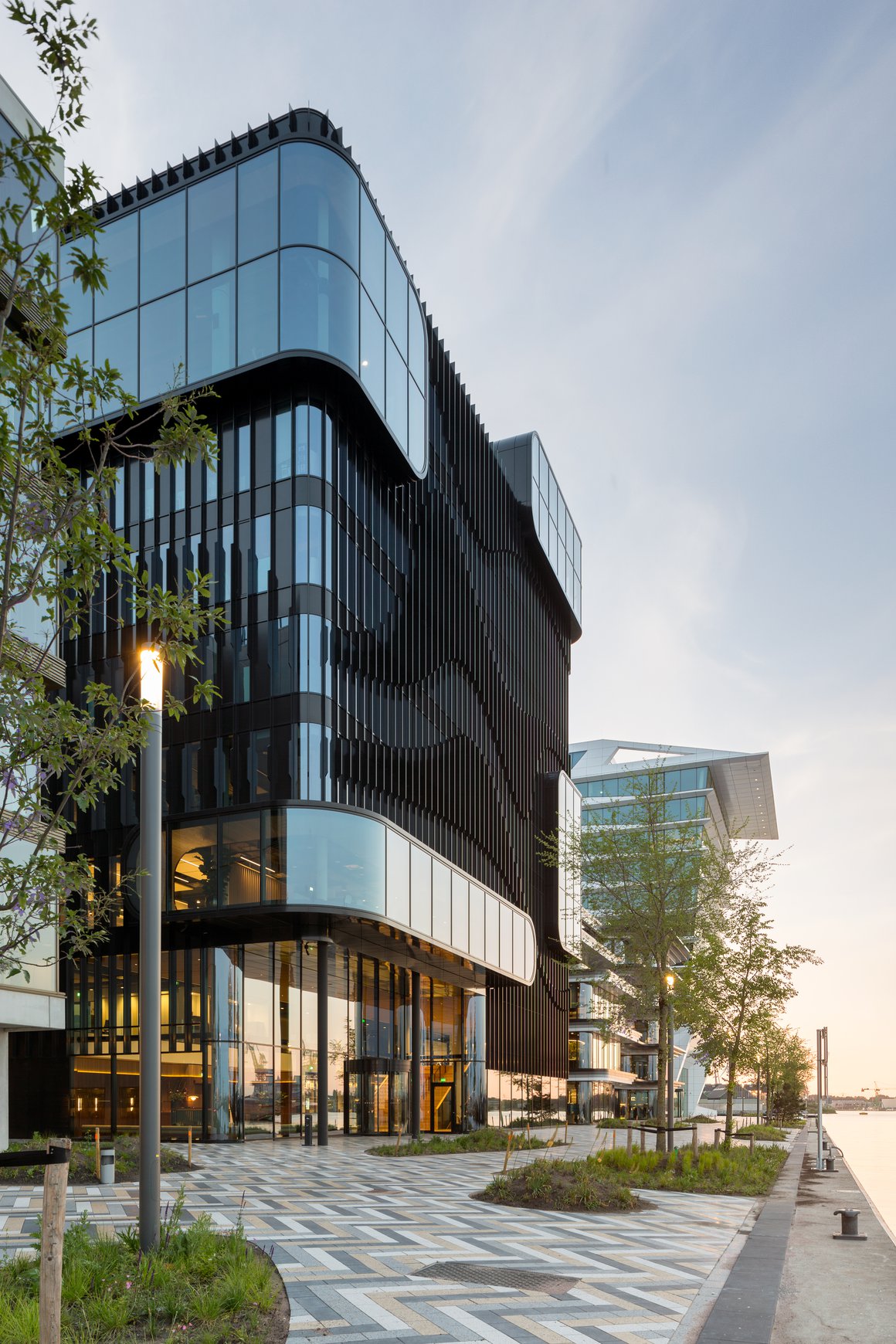
For the smallest of the PVH Campus buildings, the waterfall inspired us– a poetic meeting of land and water that we wanted to channel in our design. The 125 Danzigerkade building therefore has an organic, stratified form. Its flowing lines and expanses of sensuously curving glass ‘ripple’ spectacularly to create the entrance. Spread over four storeys, the 4,500m² building will function as a central meeting place for all those working on the campus, hence its inclusive horizontal dynamic.

Creating a campus
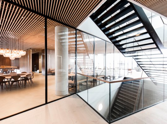
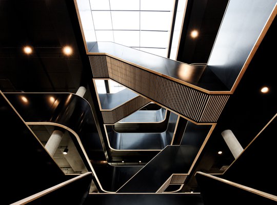
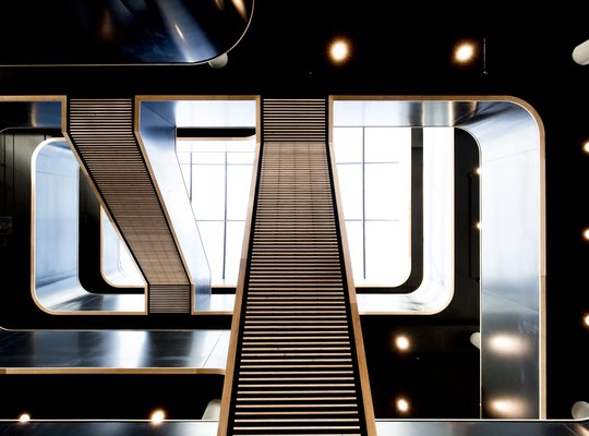
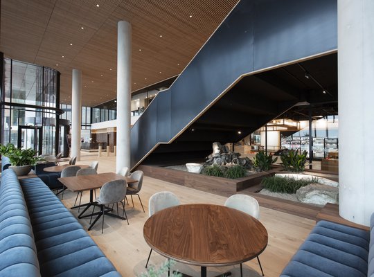
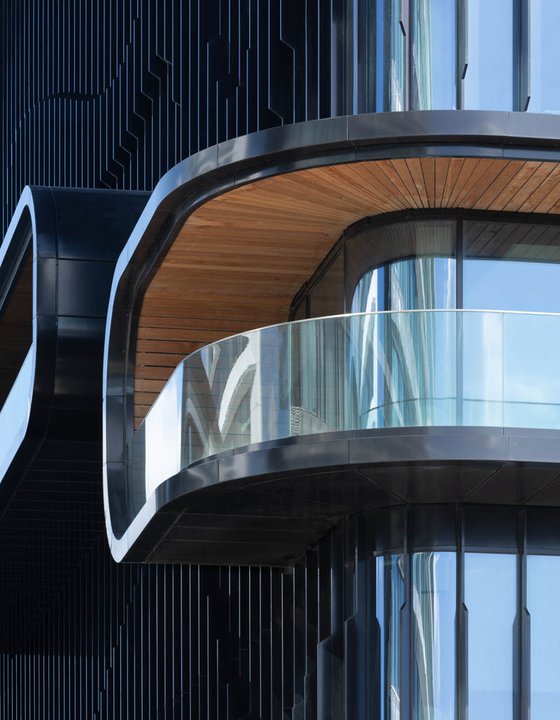
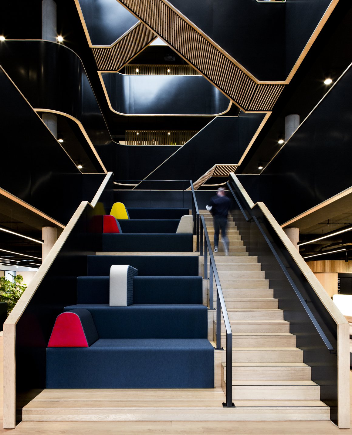
In order to encourage interaction, we designed 125 Danzigerkade as a series of landscapes. At its heart, a beautiful, sweeping atrium with abundant lush greenery will be flooded by daylight. Interweaving sculptural staircases will encourage spontaneous encounters between people. On every floor at the rear of the building, wooden decks and gardens will wrap around the exterior, following the building’s curves and culminating in a split-level roof terrace with meeting and lounge places, landscaped greenery and even sports facilities.
Views and waves
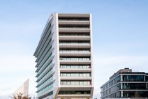
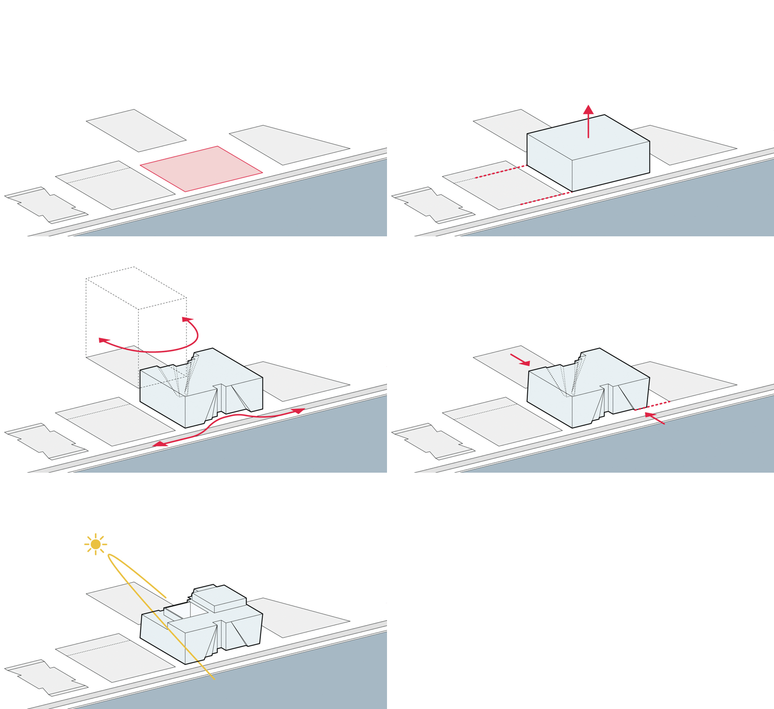
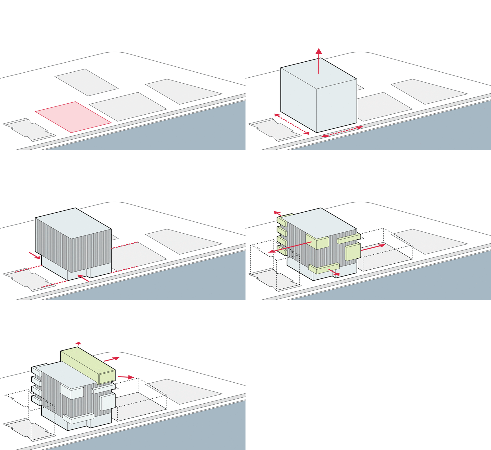
For the third building in the series, 95 Danzigerkade, we opted to balance with another high-rise volume, albeit of a different stamp. This ten-story structure takes a futuristic turn, with huge asymmetric openings and glass boxes framing eye-popping views of the IJ and the city. Placing these openings on the edges of the building allows the graphic element of the façade to take centre stage, with its sculptural louvres representing the movement of waves.
Interior Design
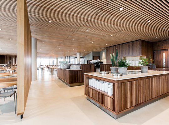
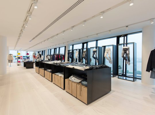
The building acts as the brands’ calling card, so our design carefully emphasises the panoramic views whenever possible – for example, at every exit from the elevator. The technical core of the building is therefore placed at the rear, which lacks views, rather than in the centre of the building. As the top five storeys of the building are used as showrooms, requiring frequent redesigns, the floorplan is flexible. Strategically placed voids allow for connection and communication between the floors.
Rhythmic combination
Seen from the water, the three buildings create an intriguing rhythm. The angular forms of the European HQ Calvin Klein & Tommy Hilfiger building gradually morph across the façades into rounded edges and flowing lines. While this building is white, 195 Danzigerkade is black – and in the middle 125 Danzigerkade has grey detailing suggestive of rock strata. The gradation of colour helps to give cohesion to the site. Together, the three buildings will provide a full range of services for the campus occupants. Less tangibly, they will also contribute to the high-quality environment by presenting a rich variety of architectural experiences.
Factsheet
PVH Europe HQ, Houthavens Amsterdam
-
ADDRESS
Danzigerkade 165, 1013 AP Amsterdam
-
CLIENT
PVH Europe: Calvin Klein & Tommy Hilfiger
-
DEVELOPER
Heren2, Amsterdam
-
DESIGN
MVSA Architects
-
CONSTRUCTION
Ingenieursbureau Kooij & Dekker
-
INSTALLATIONS
Huisman & van Muijen
-
CONTRACTOR
HerenBouw, Amsterdam
-
TOTAL BVO
33.000 m2
-
TOTAL VVO
30.000 m2
-
PROGRAMME
Offices, showroom, PVH University, fitness, yoga
-
COMPLETION
April 2018
Wall of Fame
NEWS
AWARDS
NEWS
AWARDS
Architecture Masterprize
- Honorable Mention in Architectural Design
Chicago Athenaeum International Architecture Award
Blueprint Awards 2017
- Nomination Best Non-Pubic Project: Commercial
